1. The Challenge: Restructuring the Order of Fragmented Archives
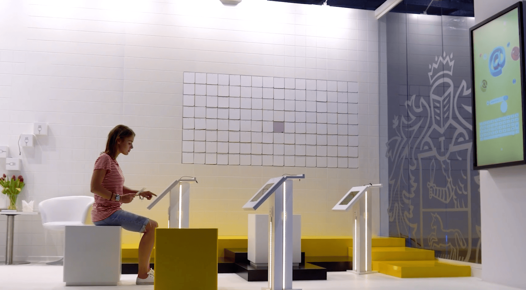
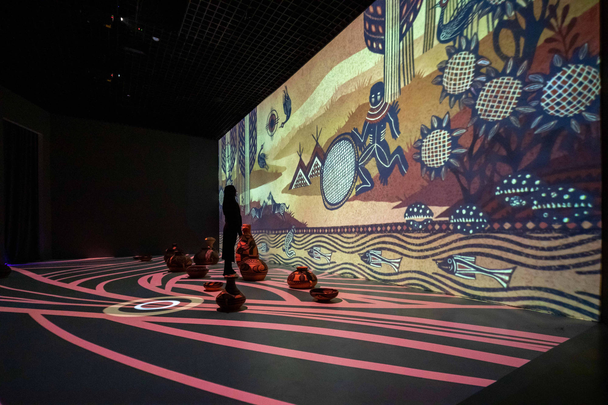
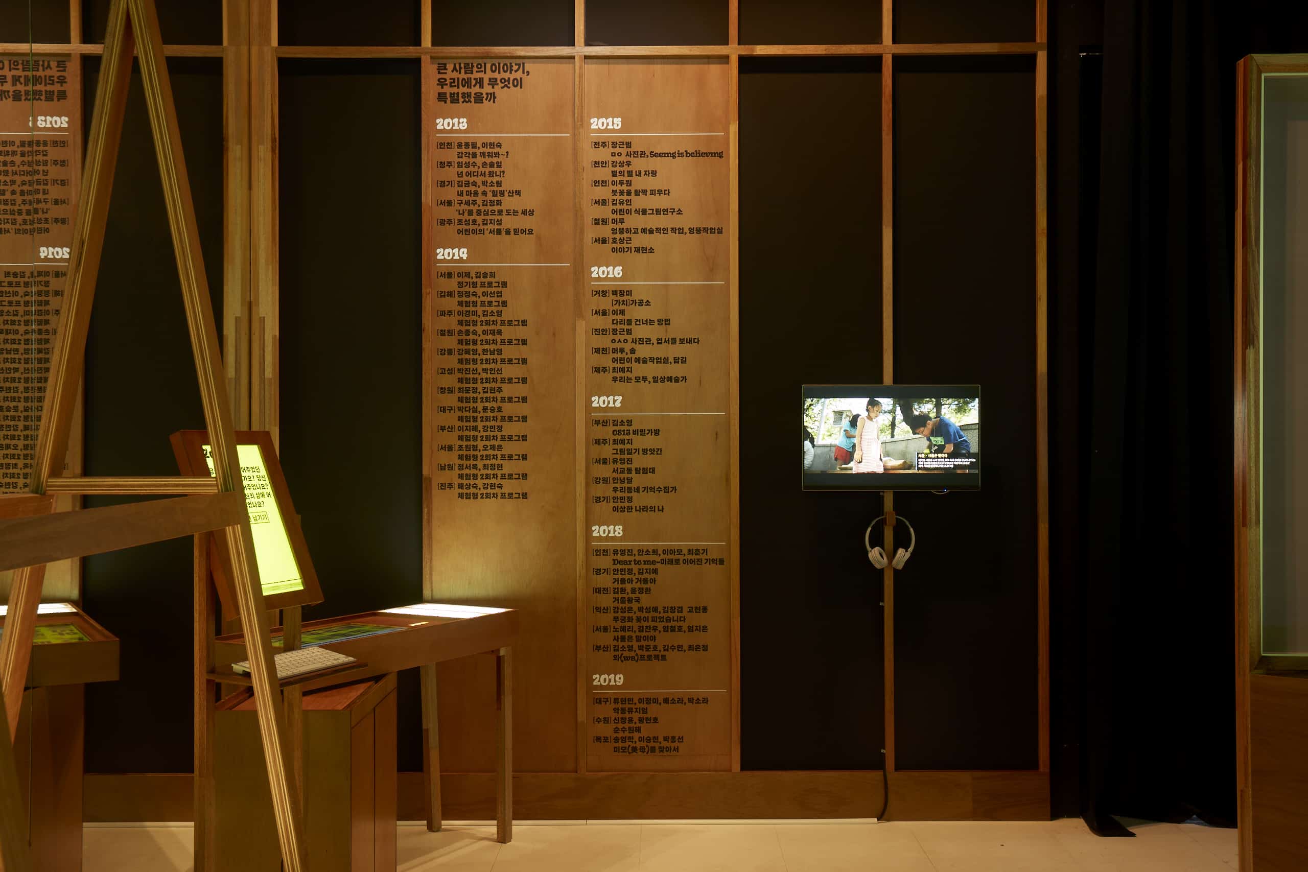
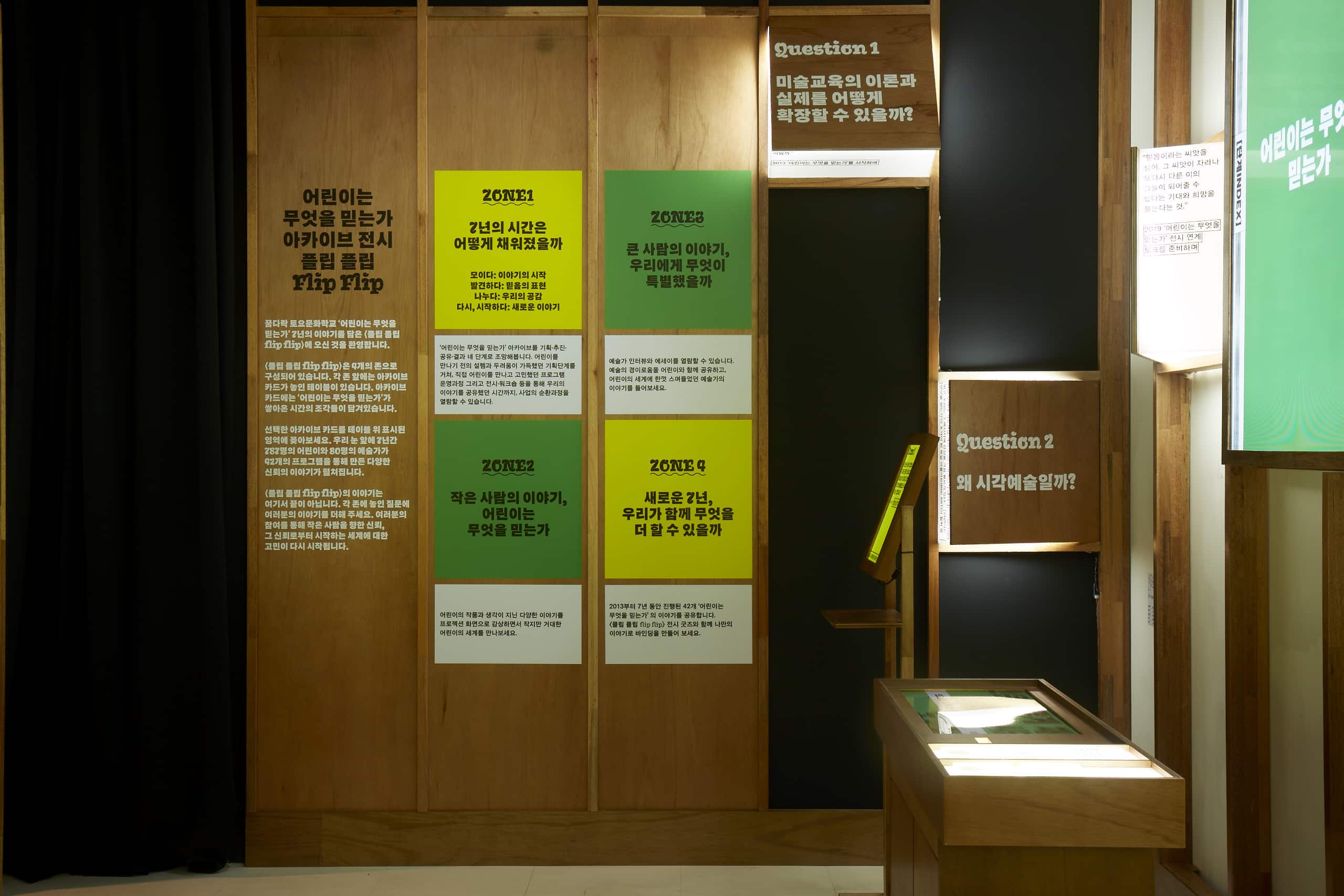
“What Children Believe” is a long-term arts education initiative spearheaded by the Korea Arts & Culture Education Service (KACES) over a seven-year period. Faced with an immense collection of fragmented and heterogeneous records—spanning 42 projects, 787 children, and 80 artists—the core challenge was: how can these “archives,” scattered across different times and spaces, be made to speak a unified language?
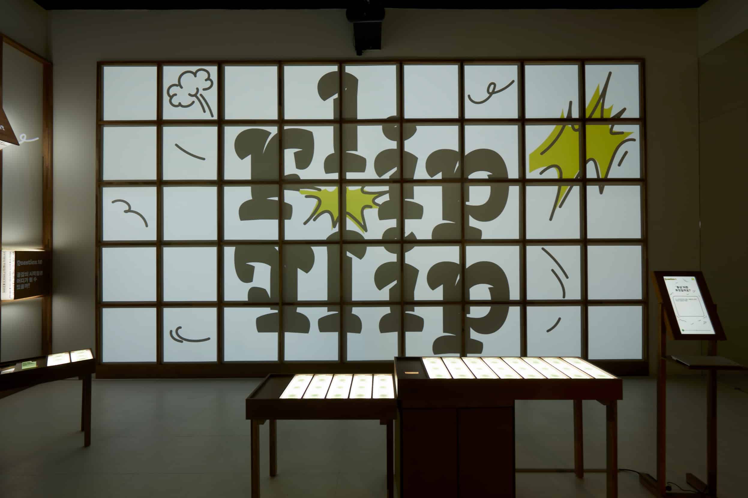
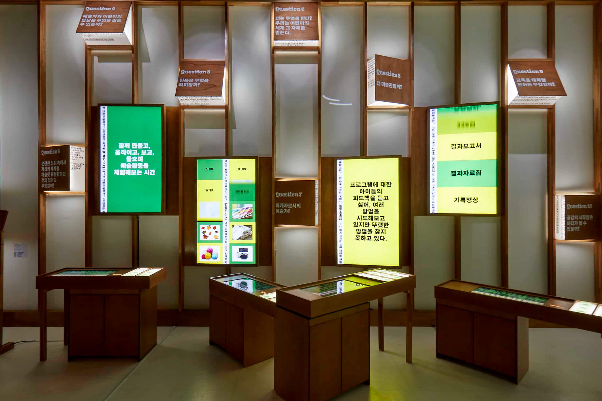
Rebel9’s response was not a conventional, linear arrangement, but a visual experiment titled “Flip Flip.”
2. Core Strategy: A Modular Visual Skeleton
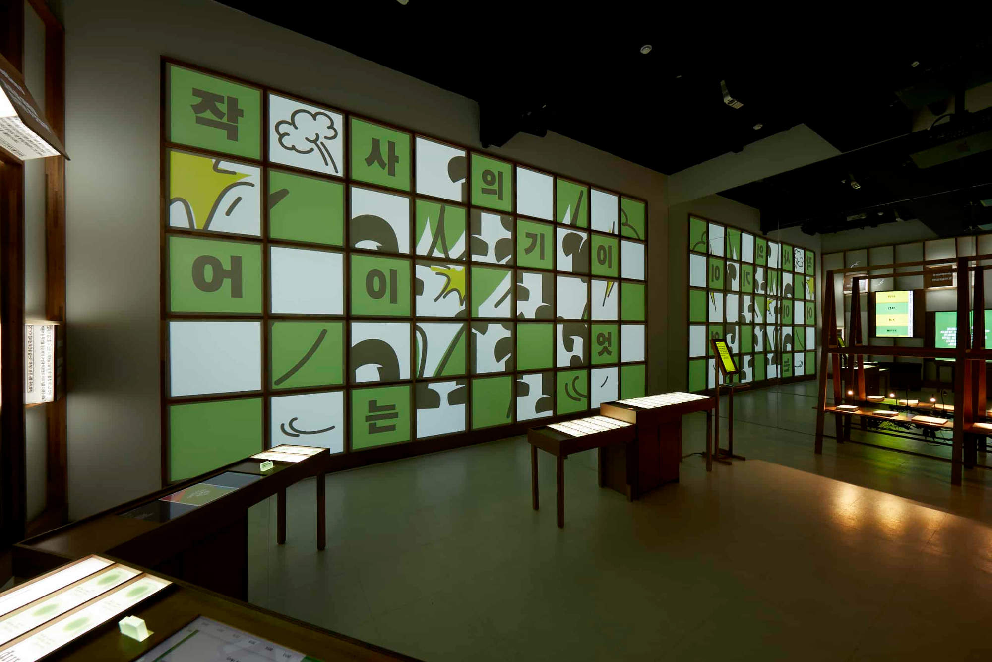
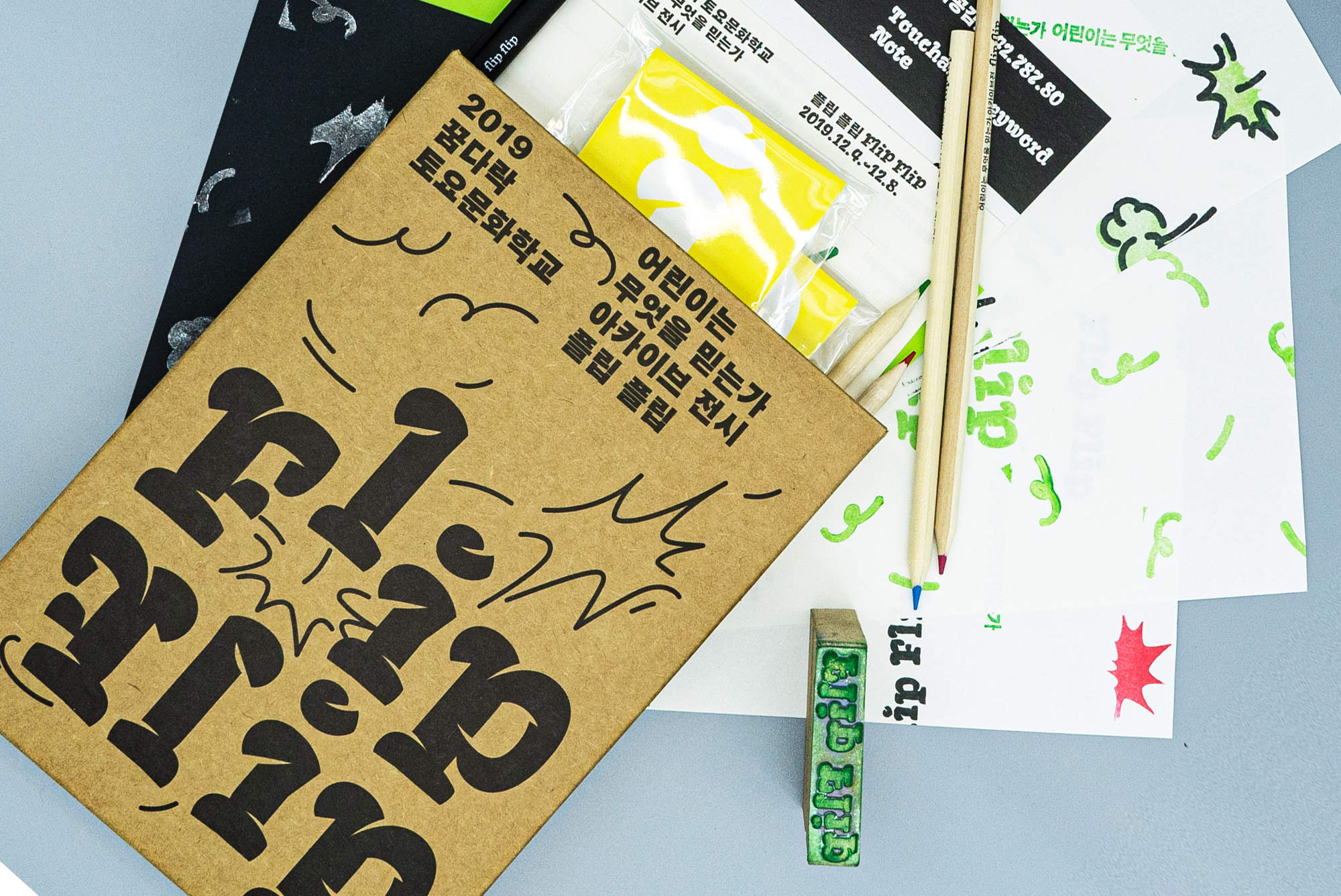
Rebel9 moved away from the conventional practice of simply updating the logo’s color each year. Instead, they constructed a comprehensive system of modular graphic logic:
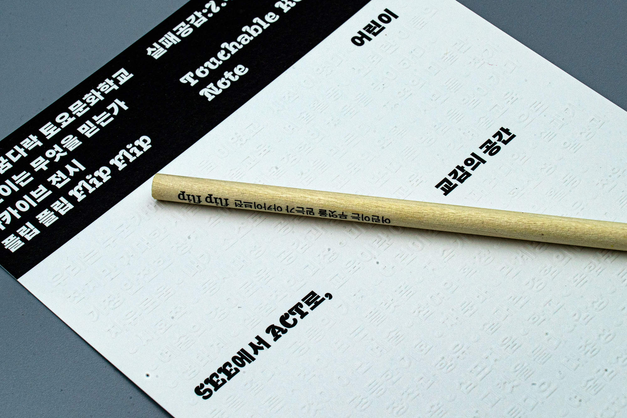
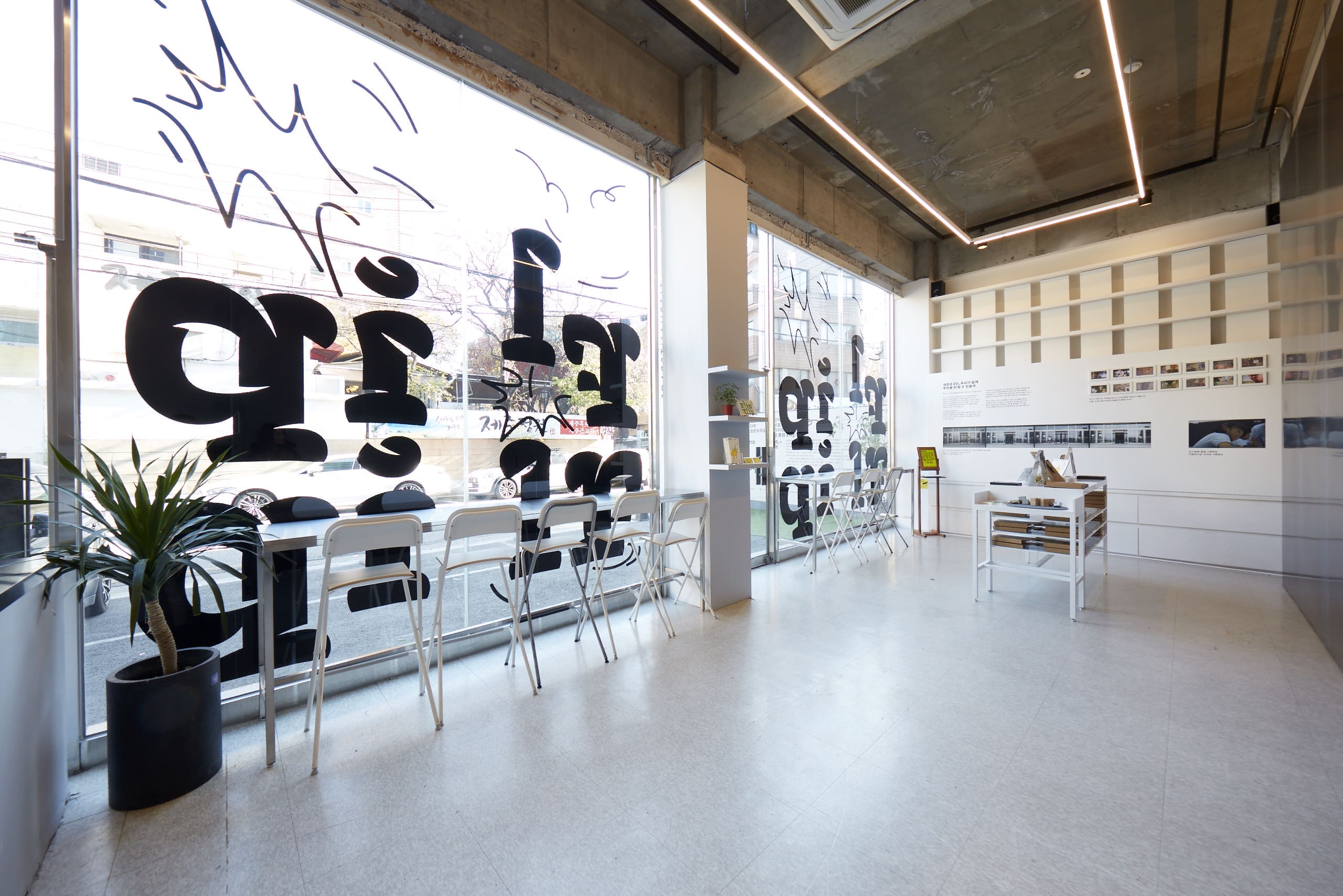
- Typography as “Emotional Expression”: The designers created a bespoke title typeface with profound visual impact and a rhythmic quality. Not only does it integrate seamlessly with Korean characters, but by meticulously adjusting line weights and spacing, it simulates the crisp, cheerful “voices” of children.
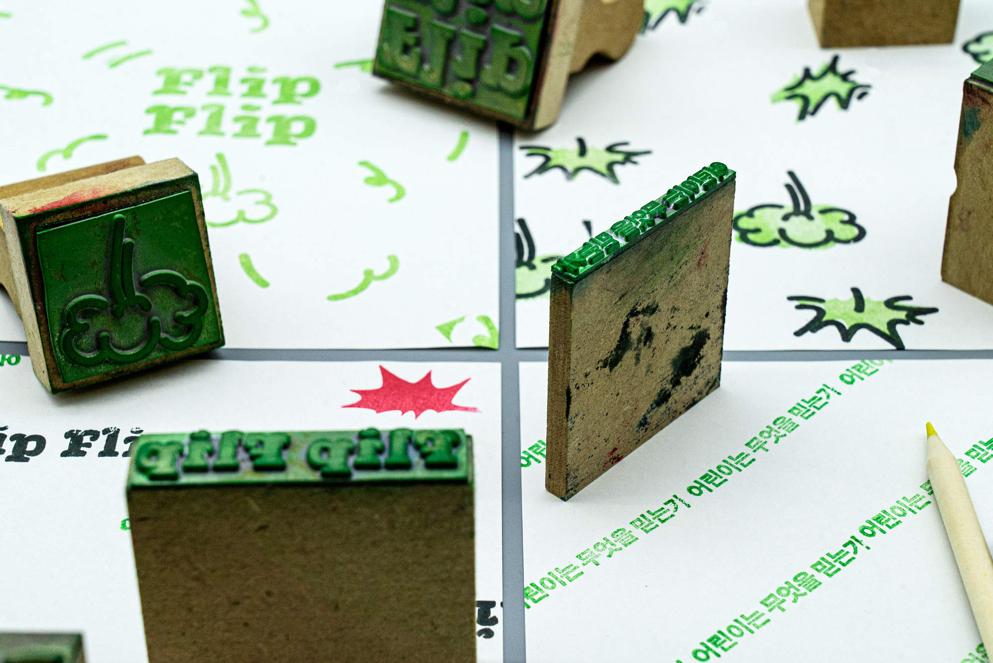
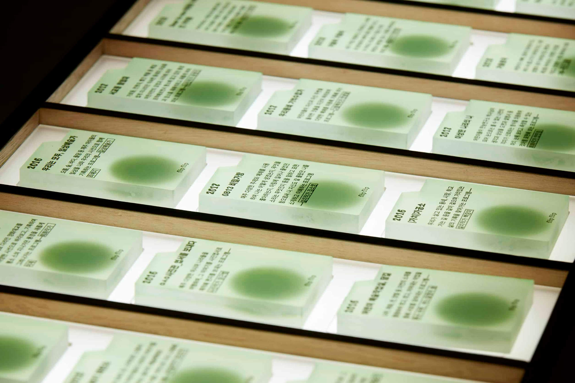
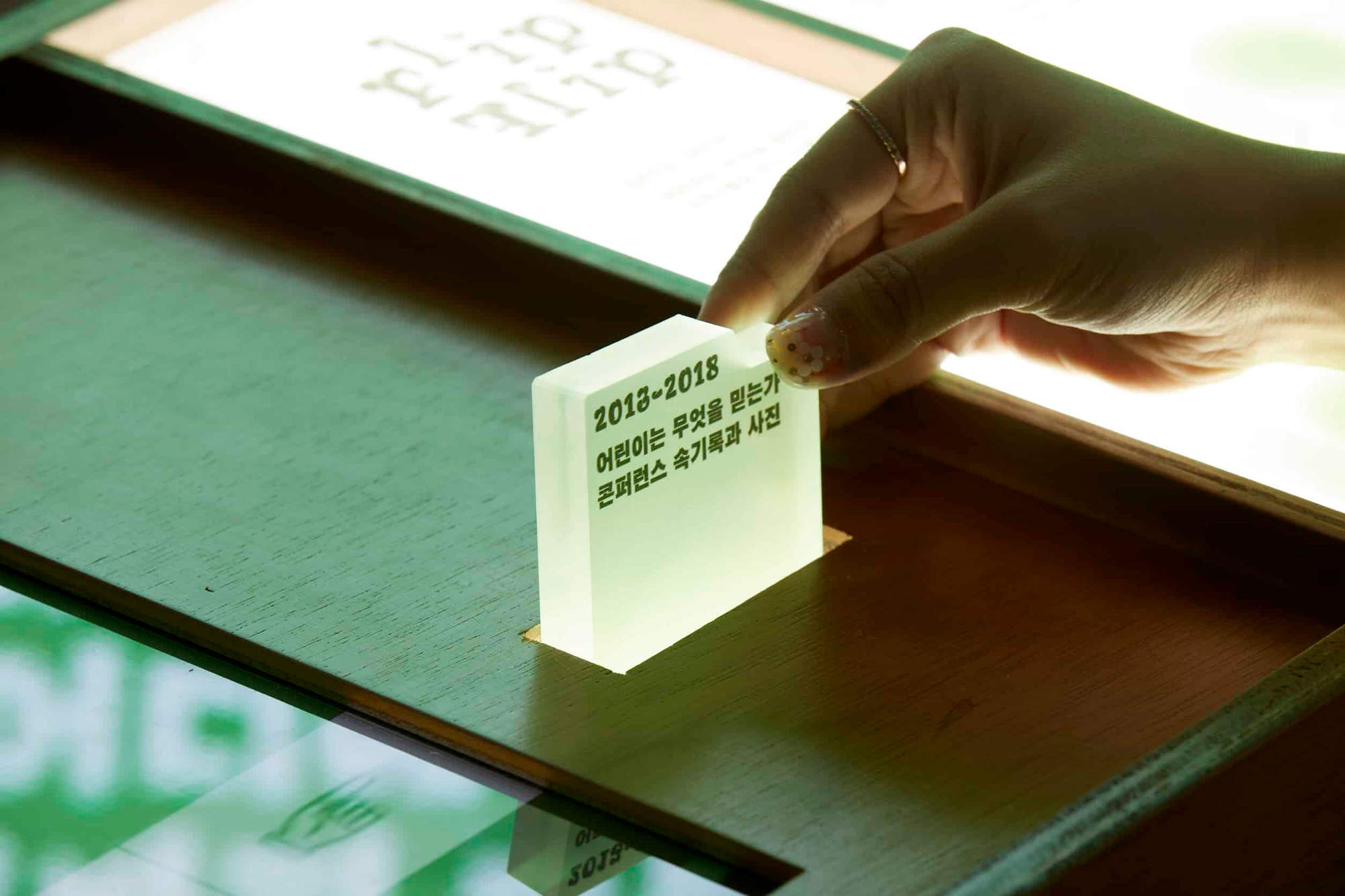
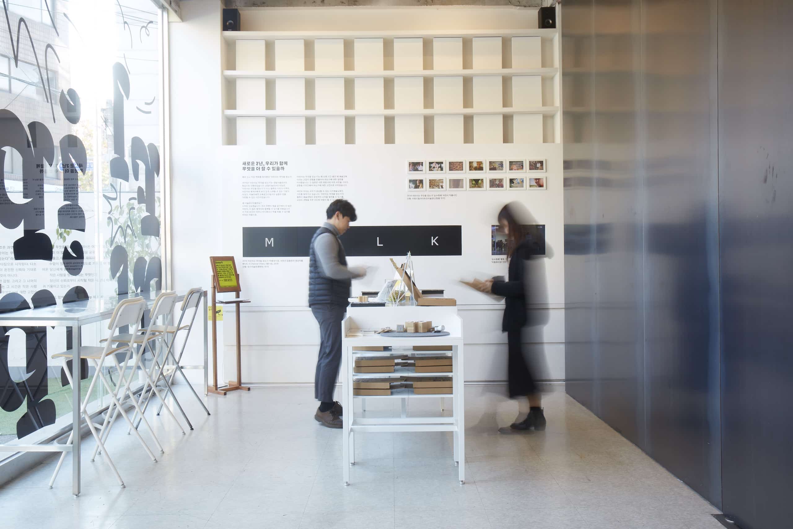
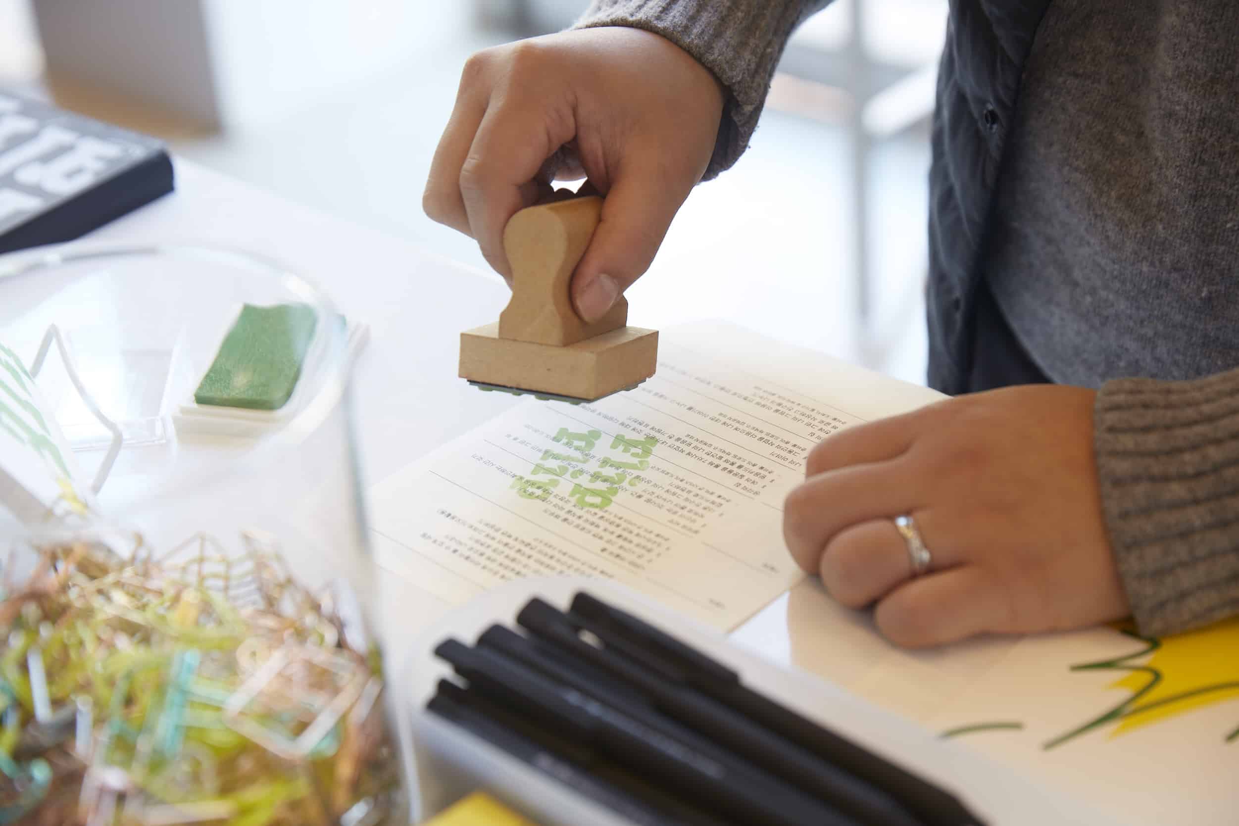
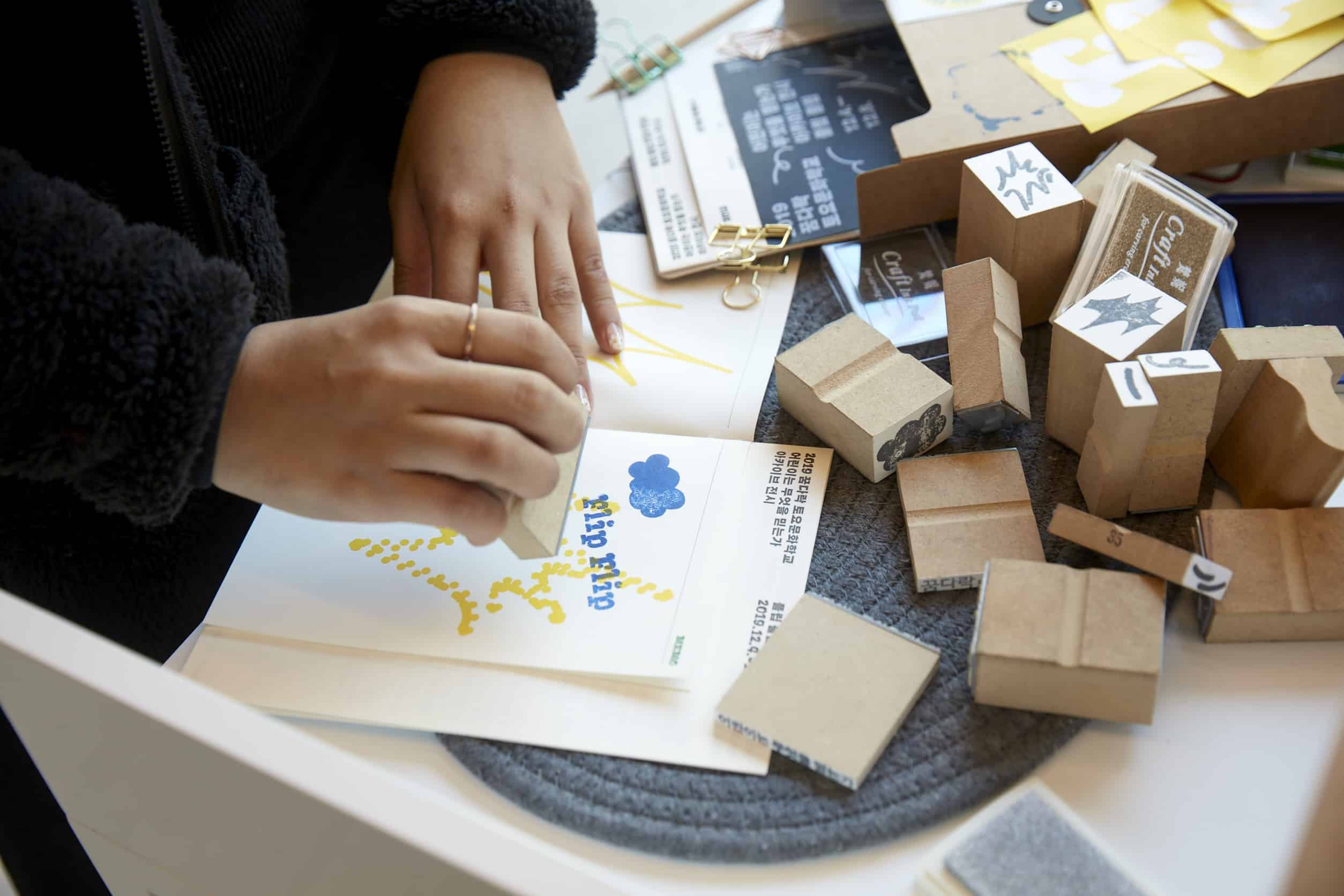
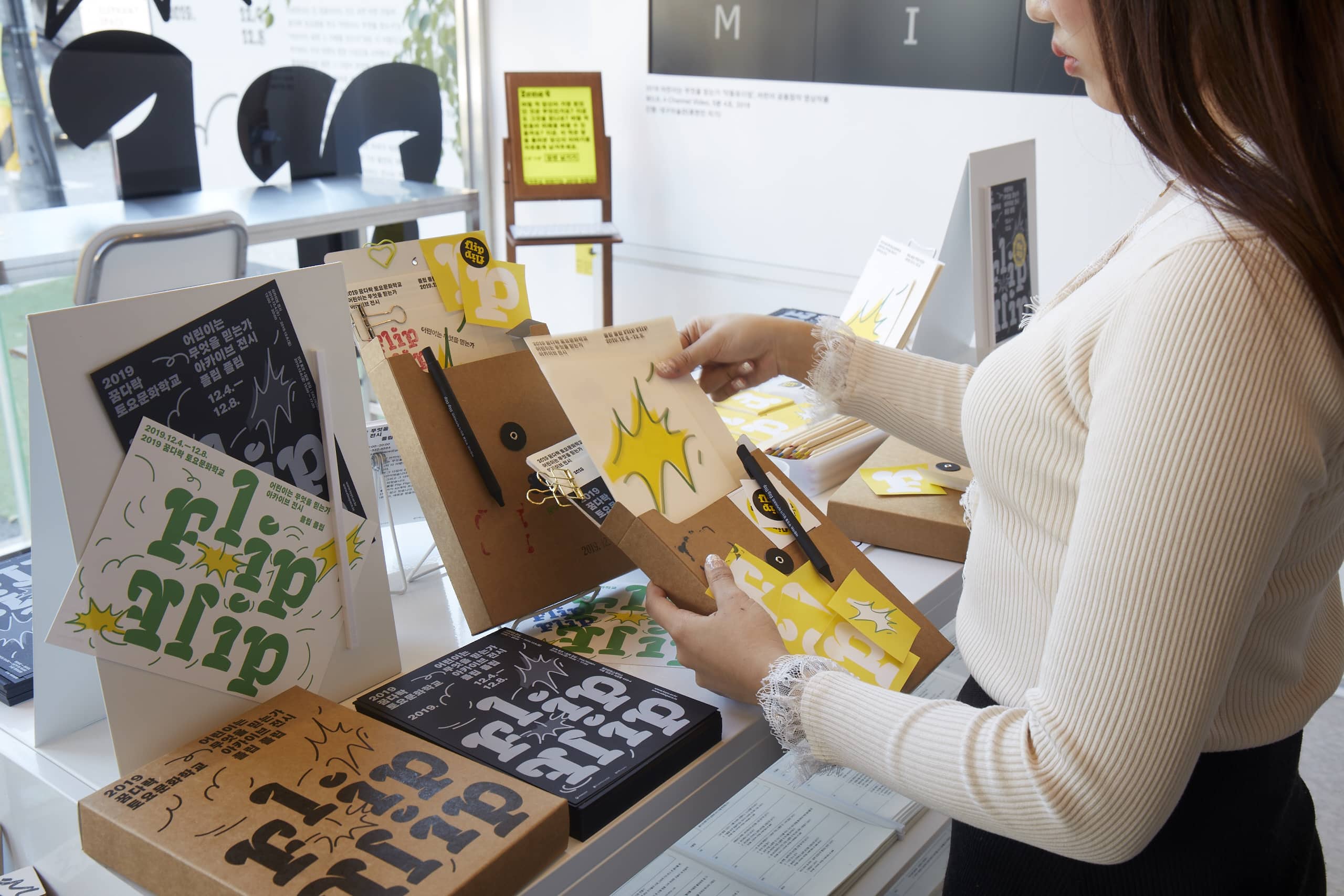
- Tactile Associations: The design team translated graphic elements into physical forms—stamps, notes, pencils, and binding boxes. This approach allows visitors to mentally connect visual stimuli with tactile and auditory sensations during the exhibition, imbuing abstract data with a sense of “human warmth.”
3. Digital Translation: A Hybrid Realm of Virtual and Physical
Faced with a massive influx of data, Rebel9 utilised its developed graphic system to achieve full-media coverage:
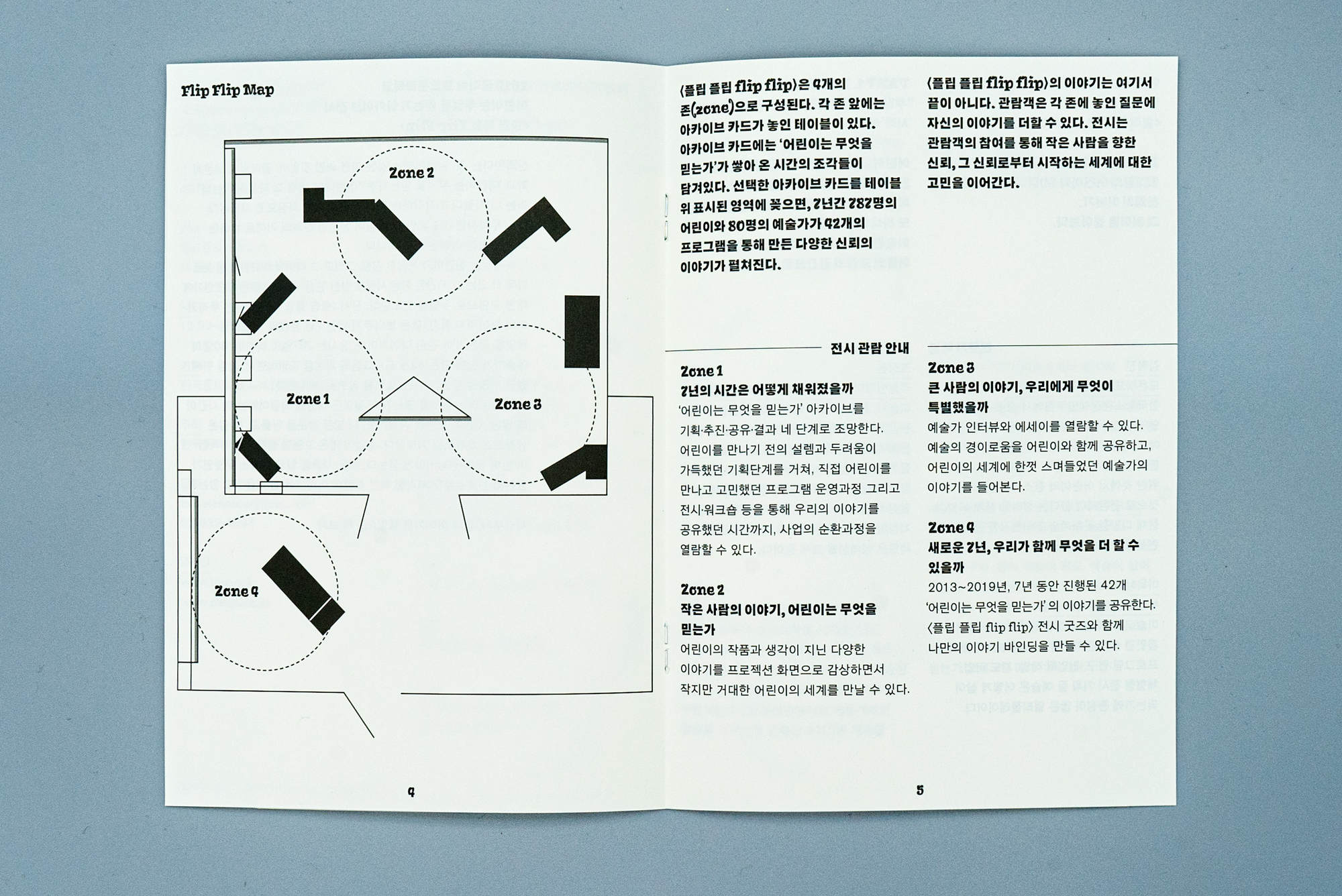
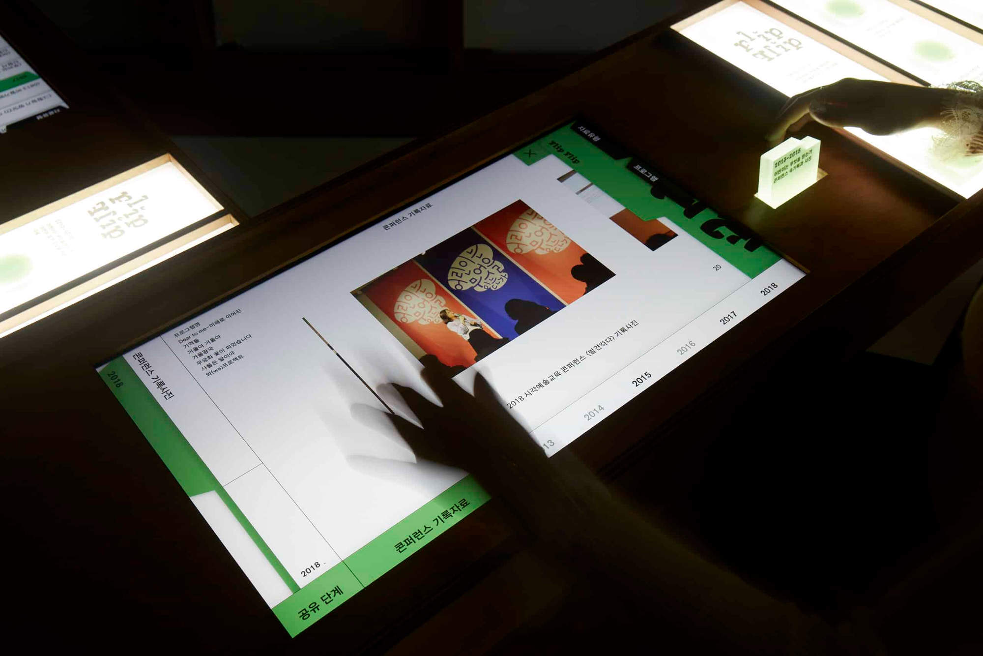
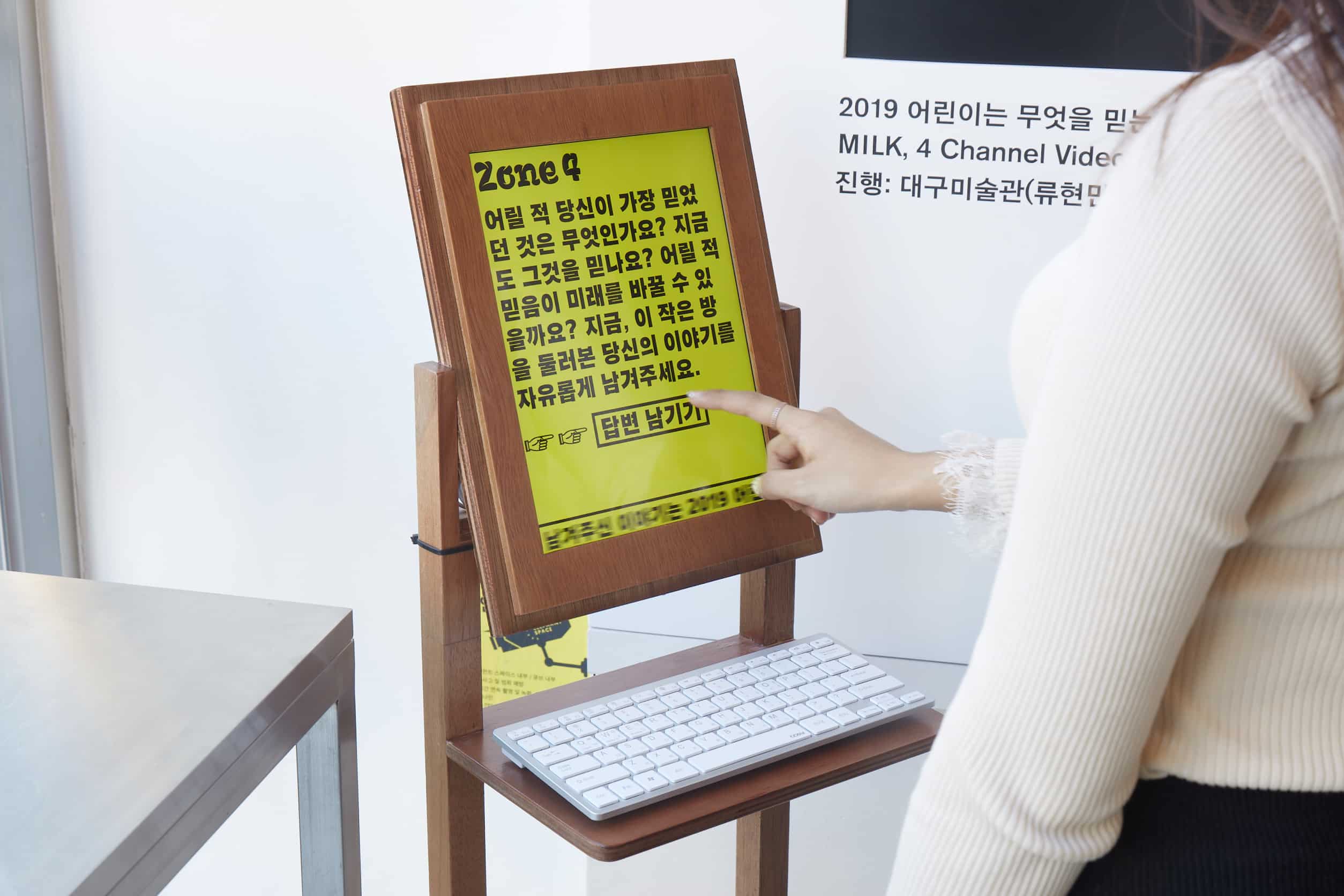
- Coherent Tonality: From printed materials to web interfaces and digital multi-media displays, all information was integrated into unified visual modules, ensuring a seamless aesthetic across all platforms.
- Participatory Archiving: The exhibition space was far more than a one-way display; it functioned as a “living laboratory.” By flipping, stamping, and recording, visitors actively participated in the secondary creation of the archives—perfectly embodying the core concept of shifting perspectives inherent in “Flip Flip.”
4. WeHow · Focus
From the viewpoint of WeHow, the brilliance of the “Flip Flip” exhibition lies in the sophisticated way it manages “information density.” Rather than succumbing to a “juvenile” aesthetic to cater to the children’s theme, the project employs a rigorously structured grid system and a logical aesthetic to support and carry the weight of the children’s unrestrained imagination.
This offers fresh inspiration for our own exhibition designs: Great interactive design begins with the creation of an orderly system—one that is inherently capable of embracing both “chaos” and “vitality.”
This article is original content published by WeHow. Unauthorized reproduction, republication, excerpting, or use of any part of this content is prohibited. For reprint permissions, licensing, or collaboration inquiries, please contact service@wehow.cn to obtain formal authorization.