非常感谢 MOC DESIGN 分享内容给 WeHow。
Thanks to MOC DESIGN for sharing with WeHow.
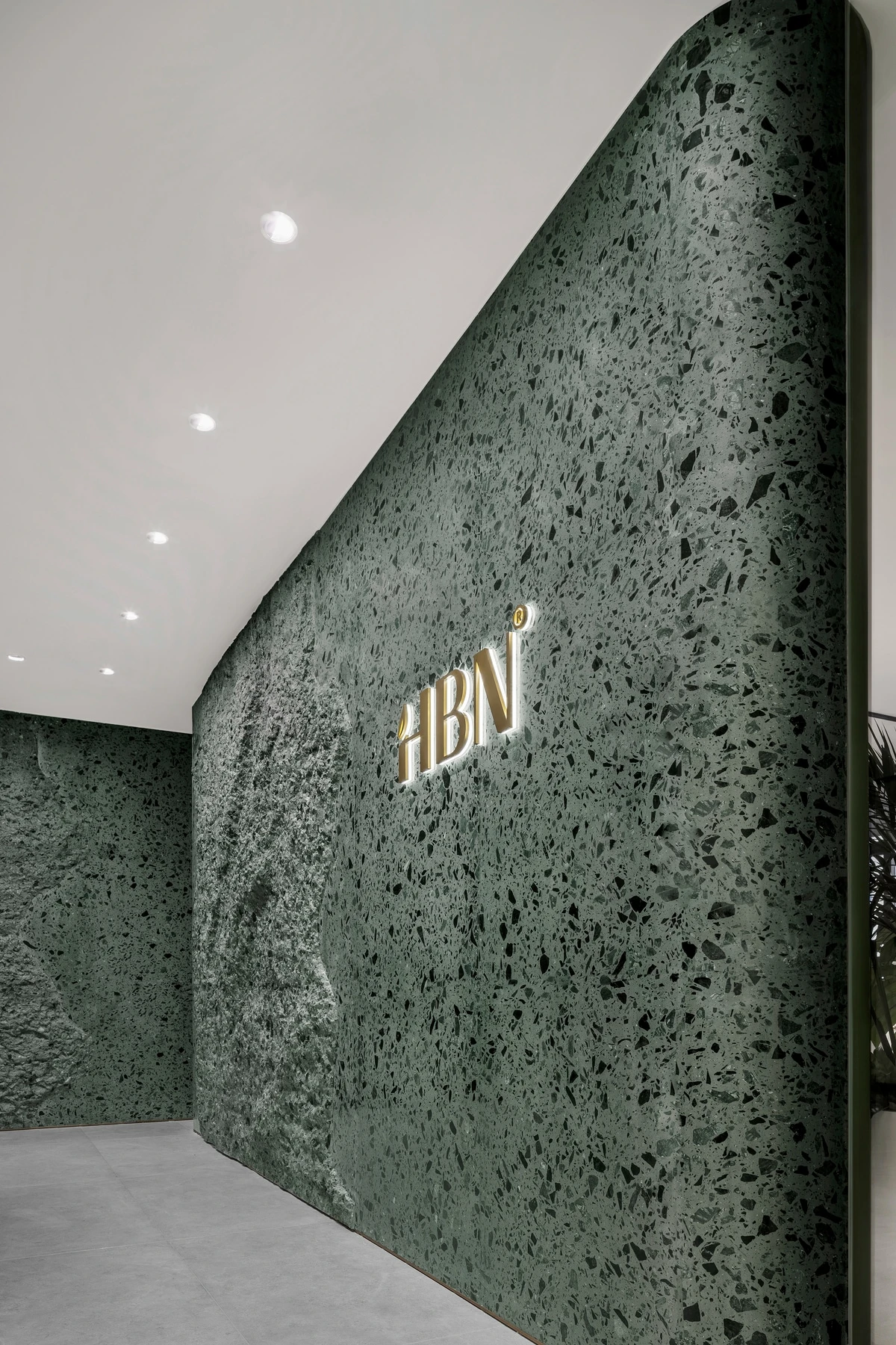
▲Texture of Image Wall
01. About HBN
Established in 2019, HBN took on the challenge and emerged as a national brand pioneering in the effective anti-aging skincare market where international brands are often favored. With millions of retinol users in 2022, HBN has become a market-leading brand, which is considered comparable to Europe and the US with its introduction of watershed skincare concept to China. After gaining a deeper understanding of HBN’s brand concept, MOC started a joint co-creation to build its new headquarters office. A new interpretation of the brand’s ultimate pursuit of skincare science is delivered in the name of retro and timeless aesthetics.
02. Skincare Science in Sight
The French scientist Henri Poincaré once said “profounder beauty which comes from the harmonious order of the parts and which a pure intelligence can grasp. This it is which gives body, a structure so to speak, to the iridescent appearances which flatter our senses, and without this support the beauty of these fugitive dreams would be only imperfect, because it would be vague and always fleeting.”
Scientific data shows that retinol is a truly effective skin care ingredient. It is also known as “Anti-wrinkle Gold” for its ability to stimulate collagen production to achieve a strong anti-wrinkle effect and restore elasticity and smoothness.
When creating the HBN brand center, MOC would like to demonstrate the intrinsic unity of science and beauty for an ingredient-oriented brand and communicate a lasting, visible scientific beauty concept to people.
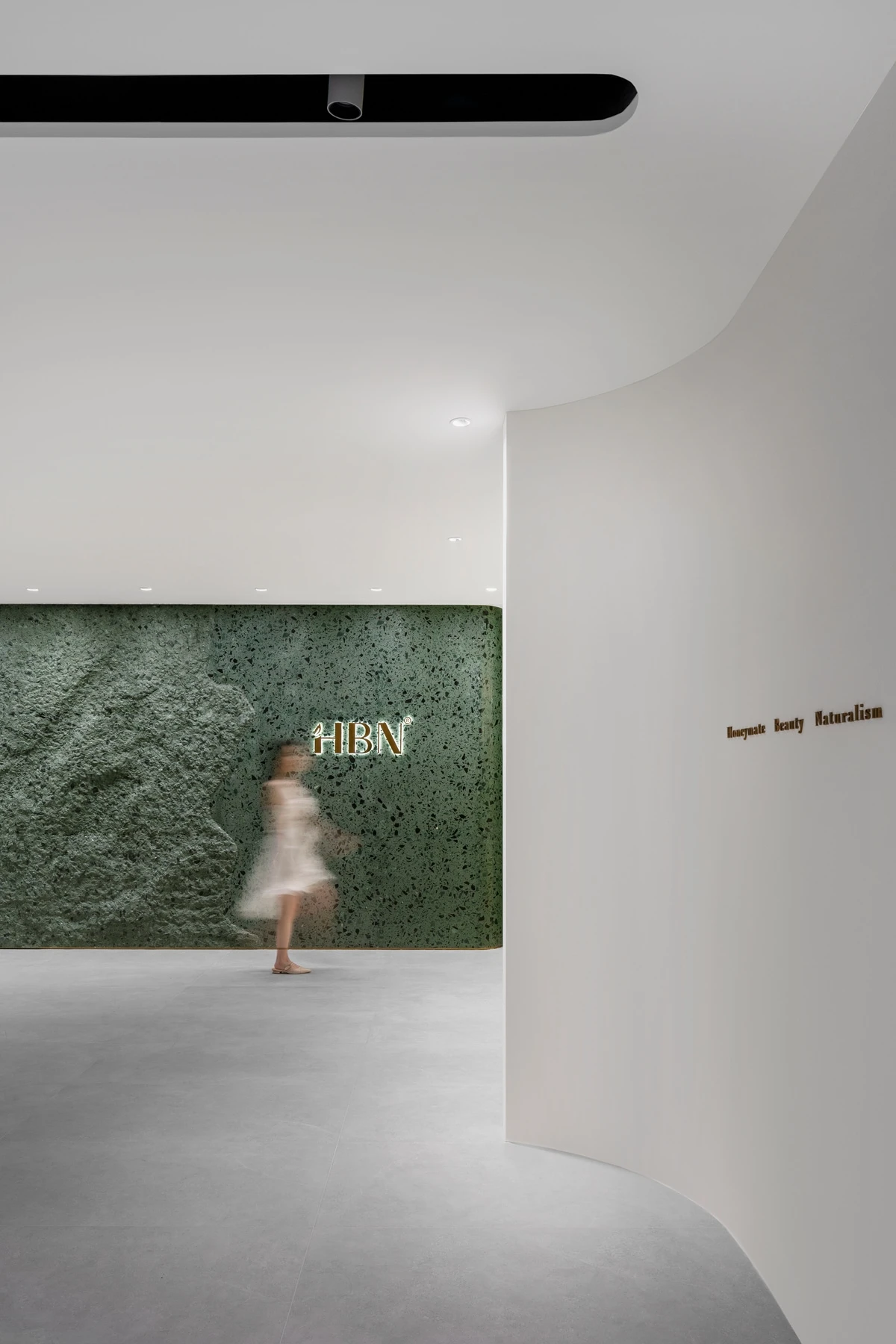
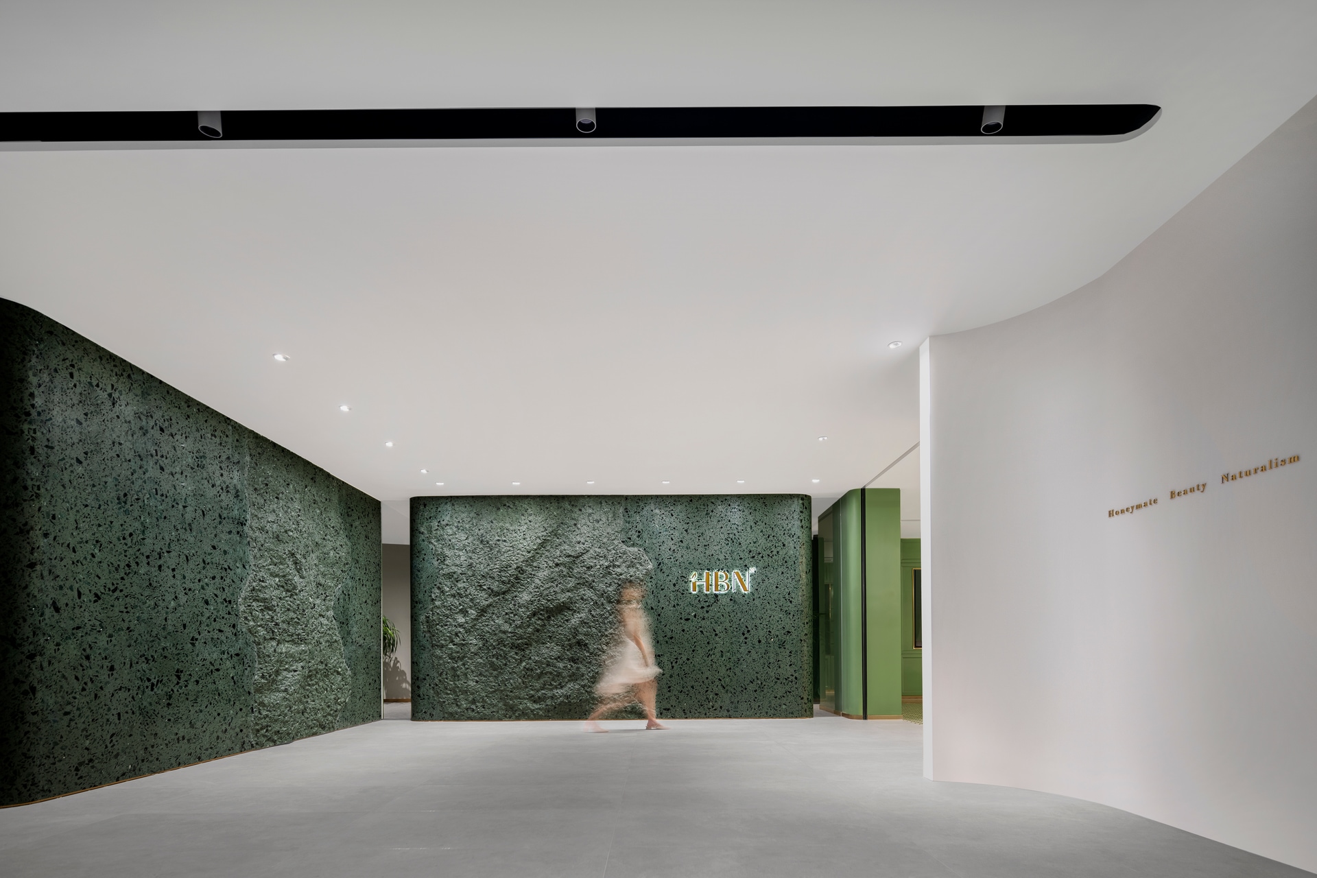
The stone used for the image wall at the entrance is changing from the rough to smooth texture, which visually and vividly demonstrates the change of skin in a long term to people walking into the showroom.
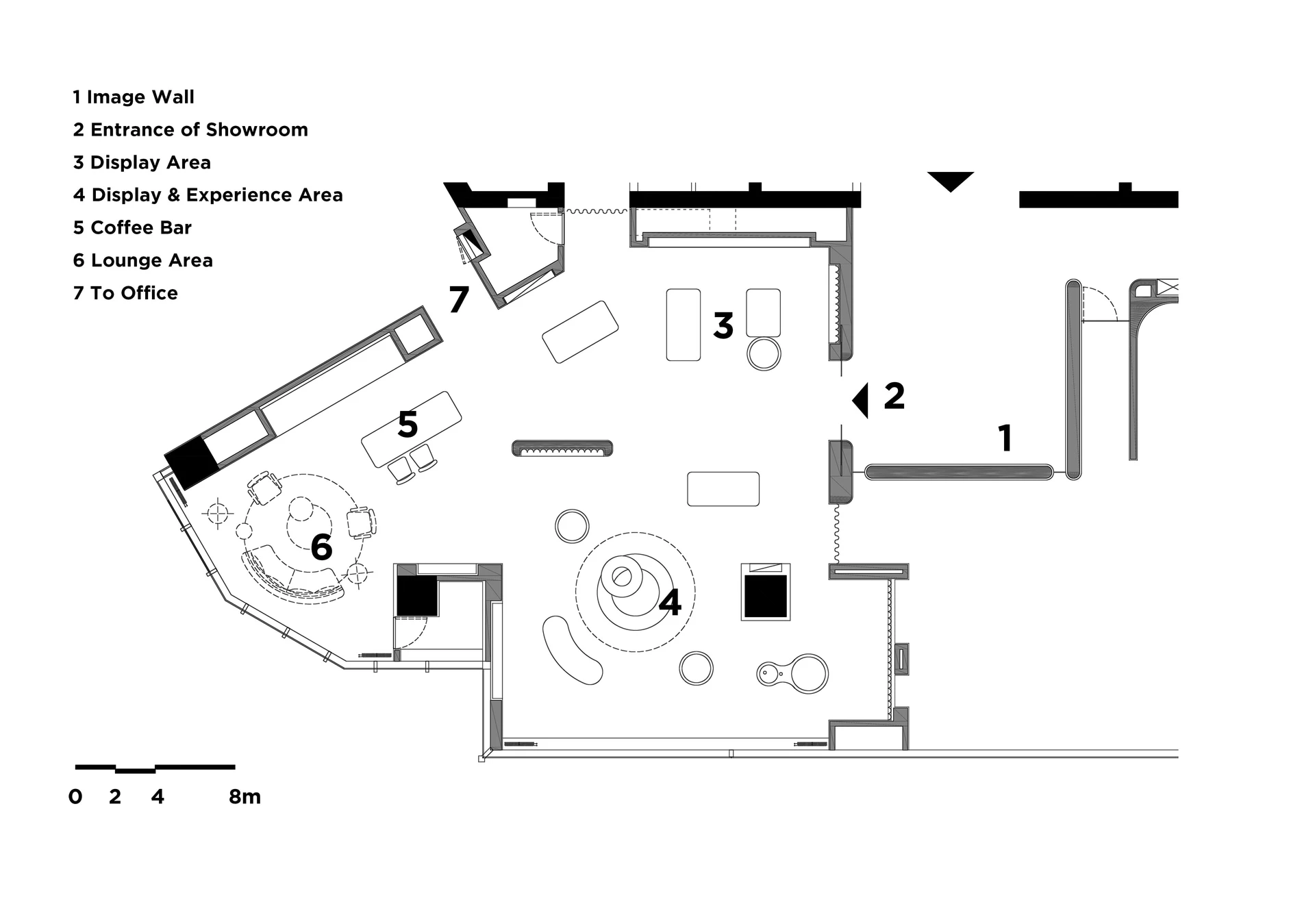
The showroom has versatile functions such as the brand image perception, visitor experience and internal staff training. The space constantly highlights the product ingredients and efficacy in the interior dialogue with consumers.
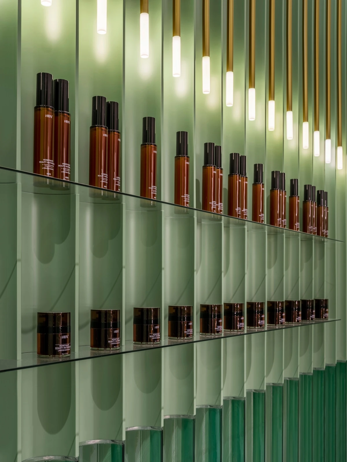
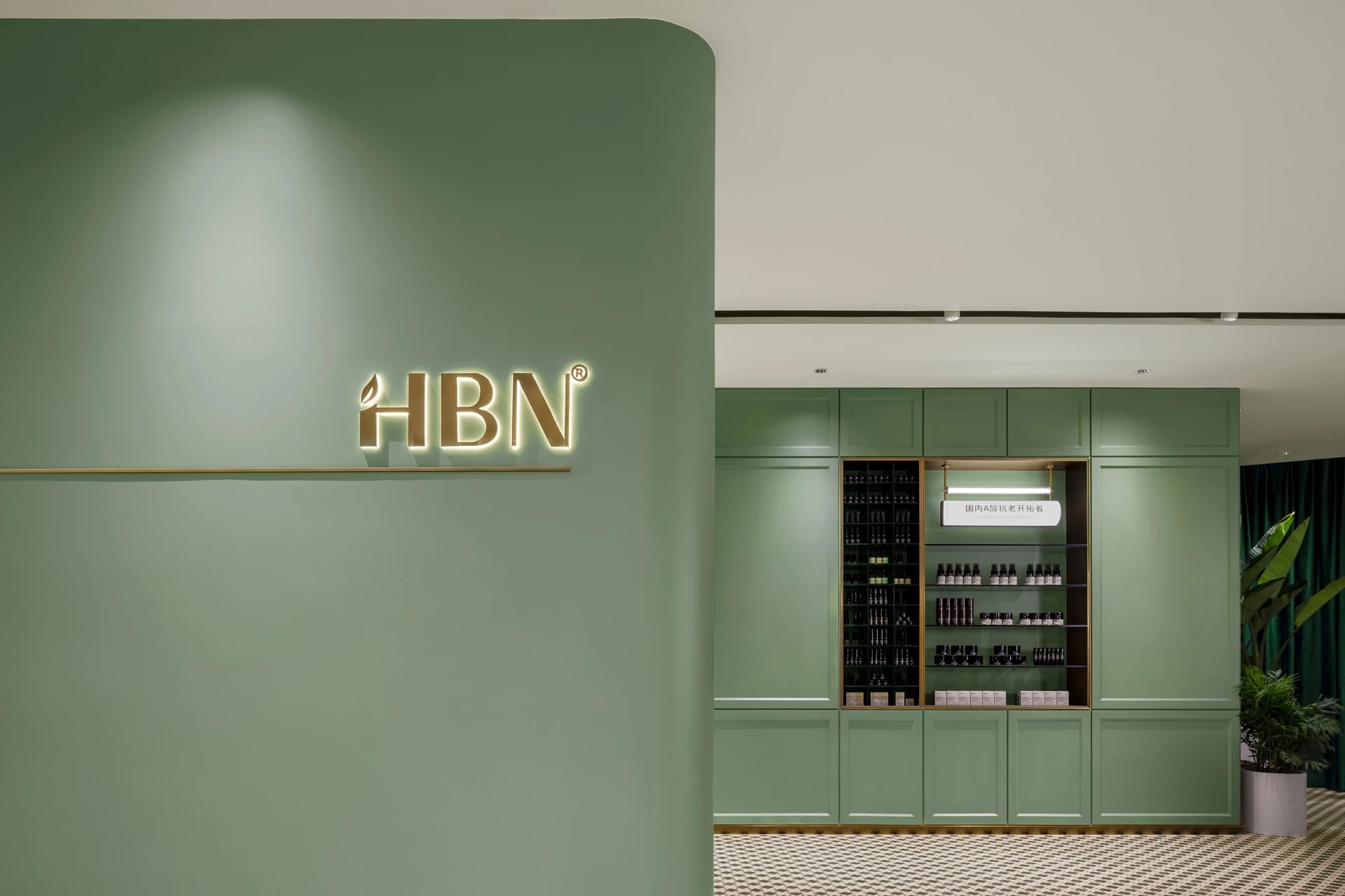
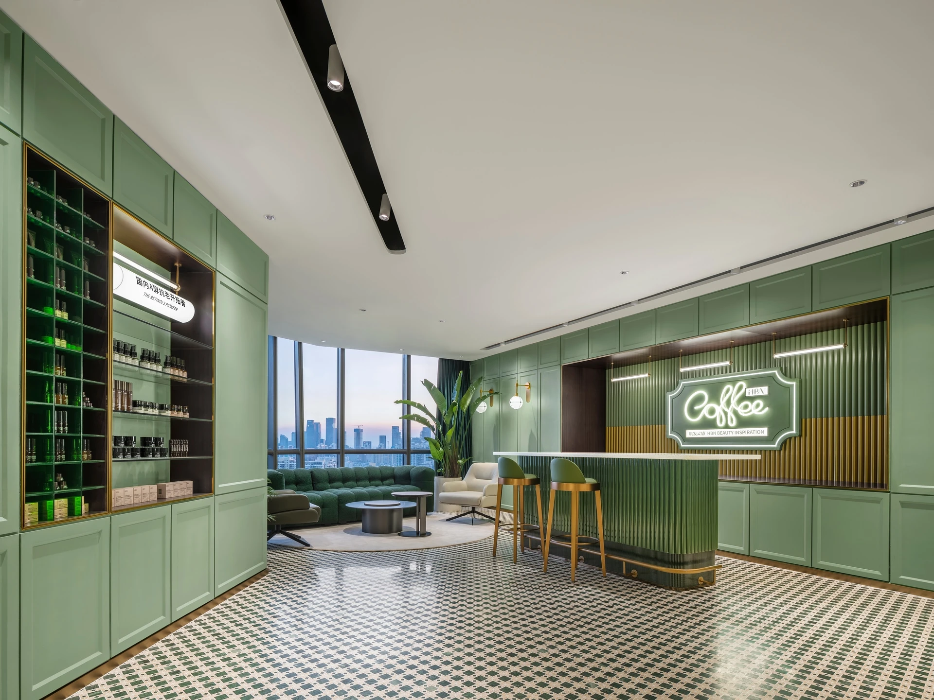
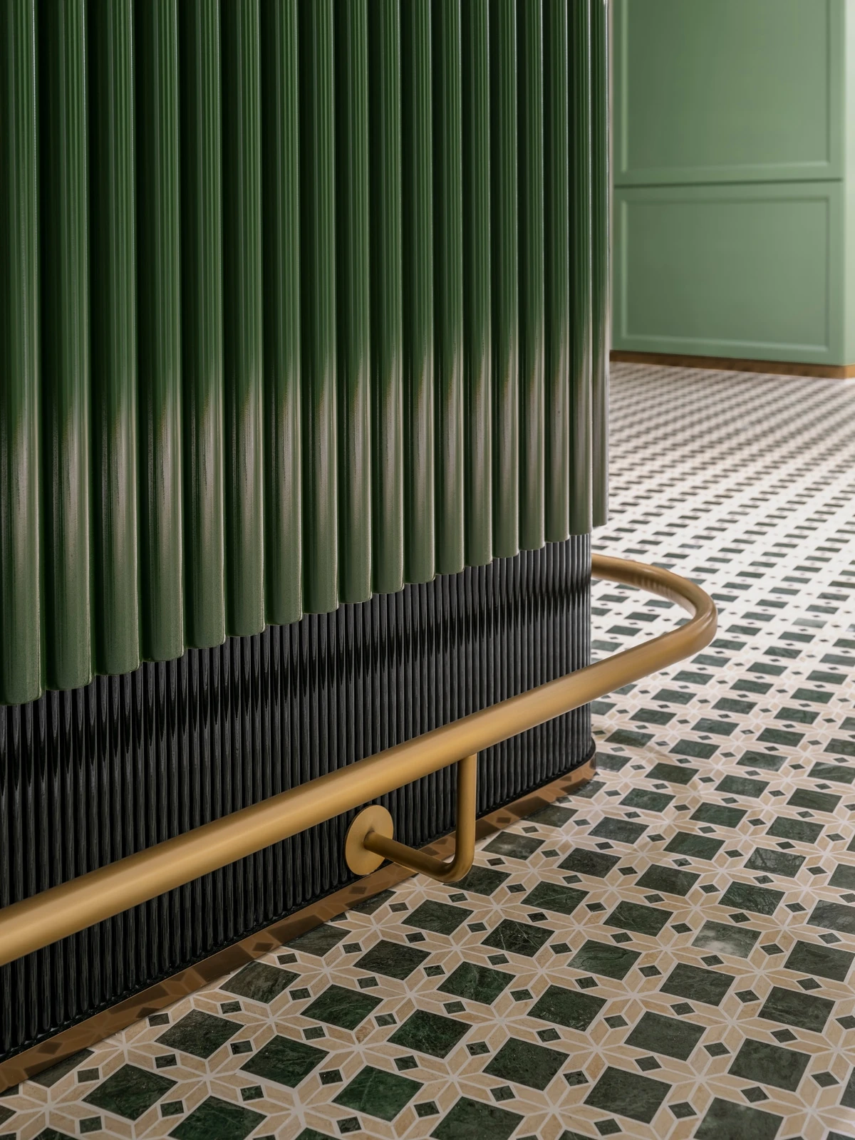
The product experience area is laid out in green with large areas of floral tiles and displayed with amber-colored products so visitors can quickly go into a retro space of science and exploration.
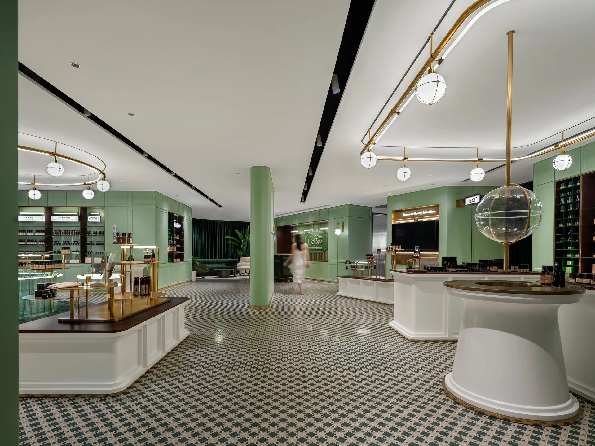
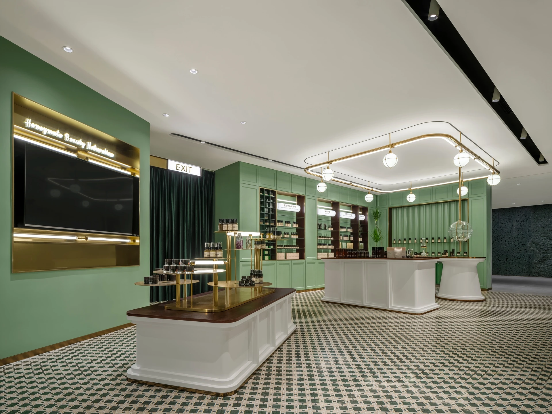
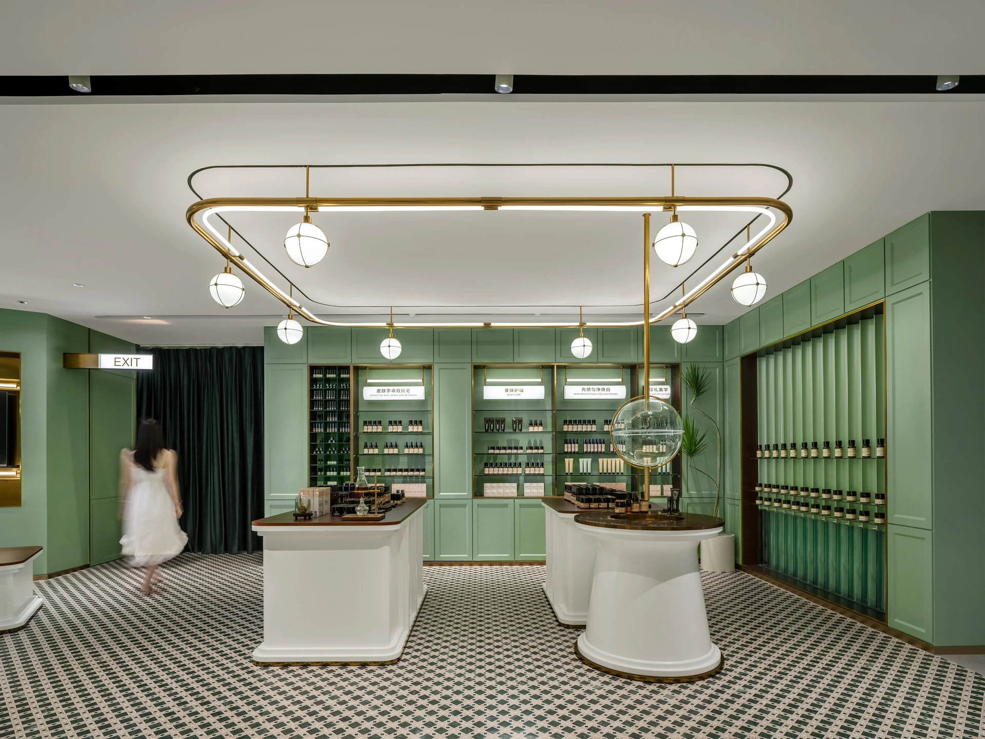
Metals and lighting run through the space, with the focus on display shelves and product arrays, which creates a sense of order to echo the brand’s artistic aesthetic of science and skincare.
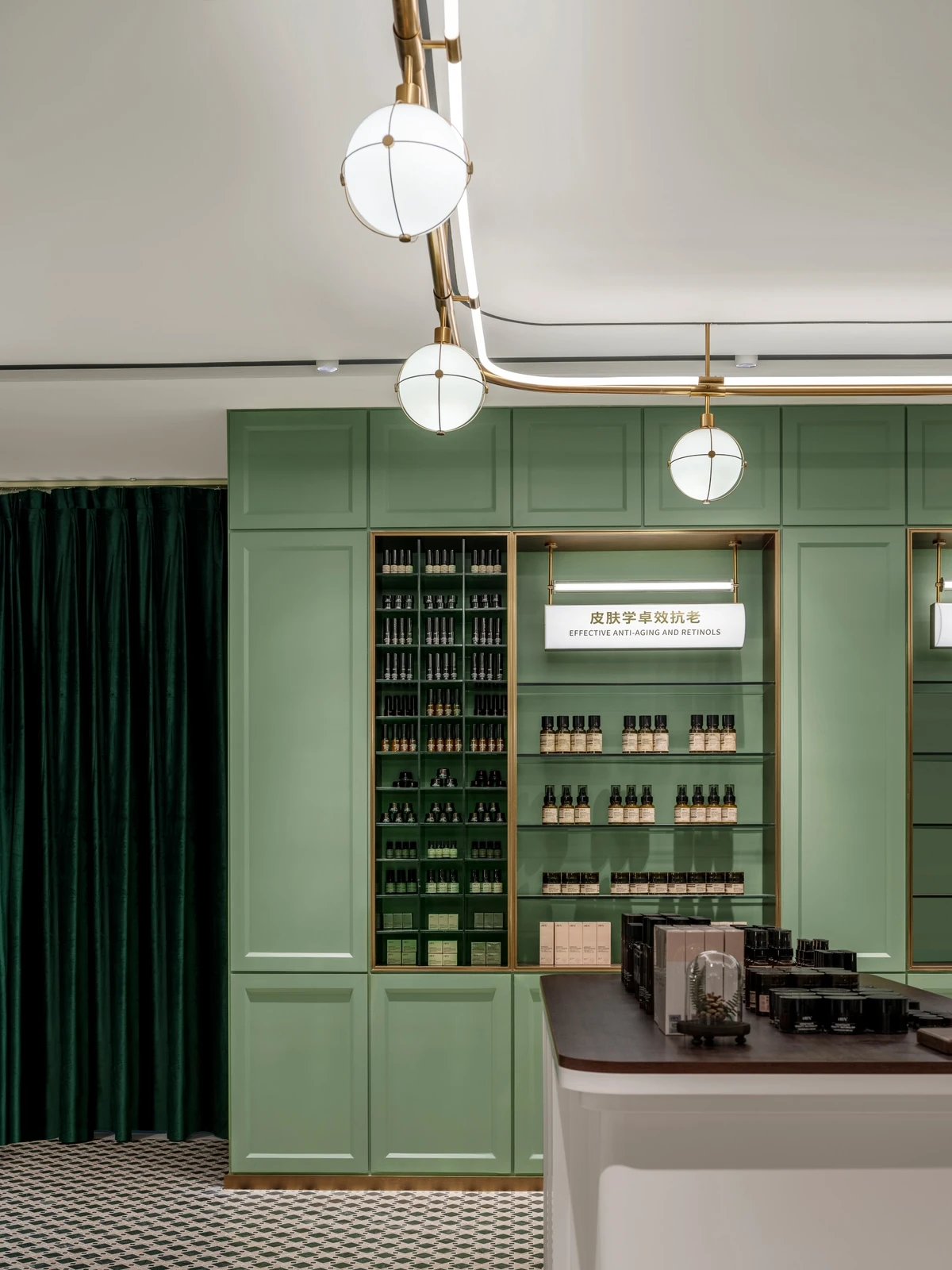
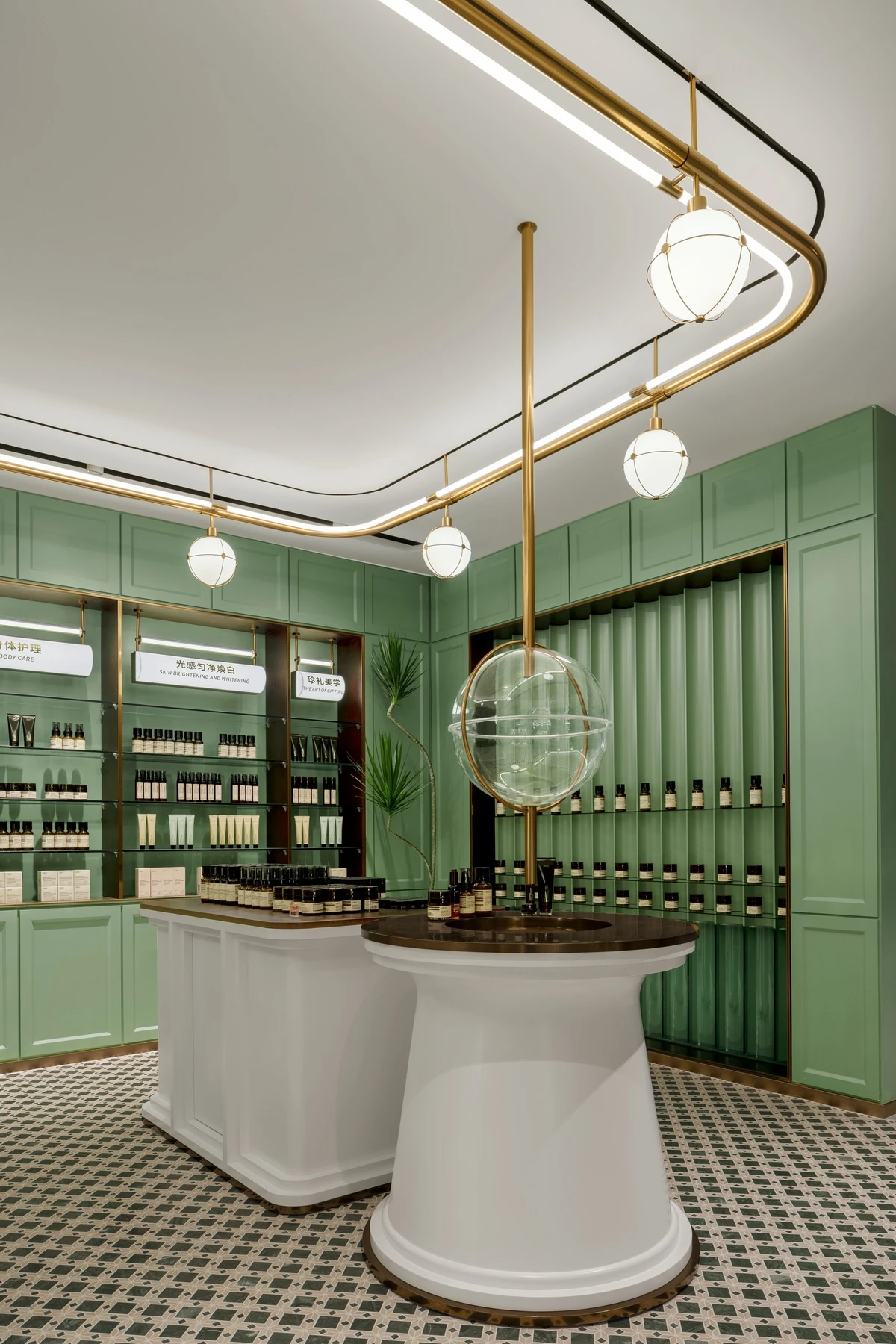
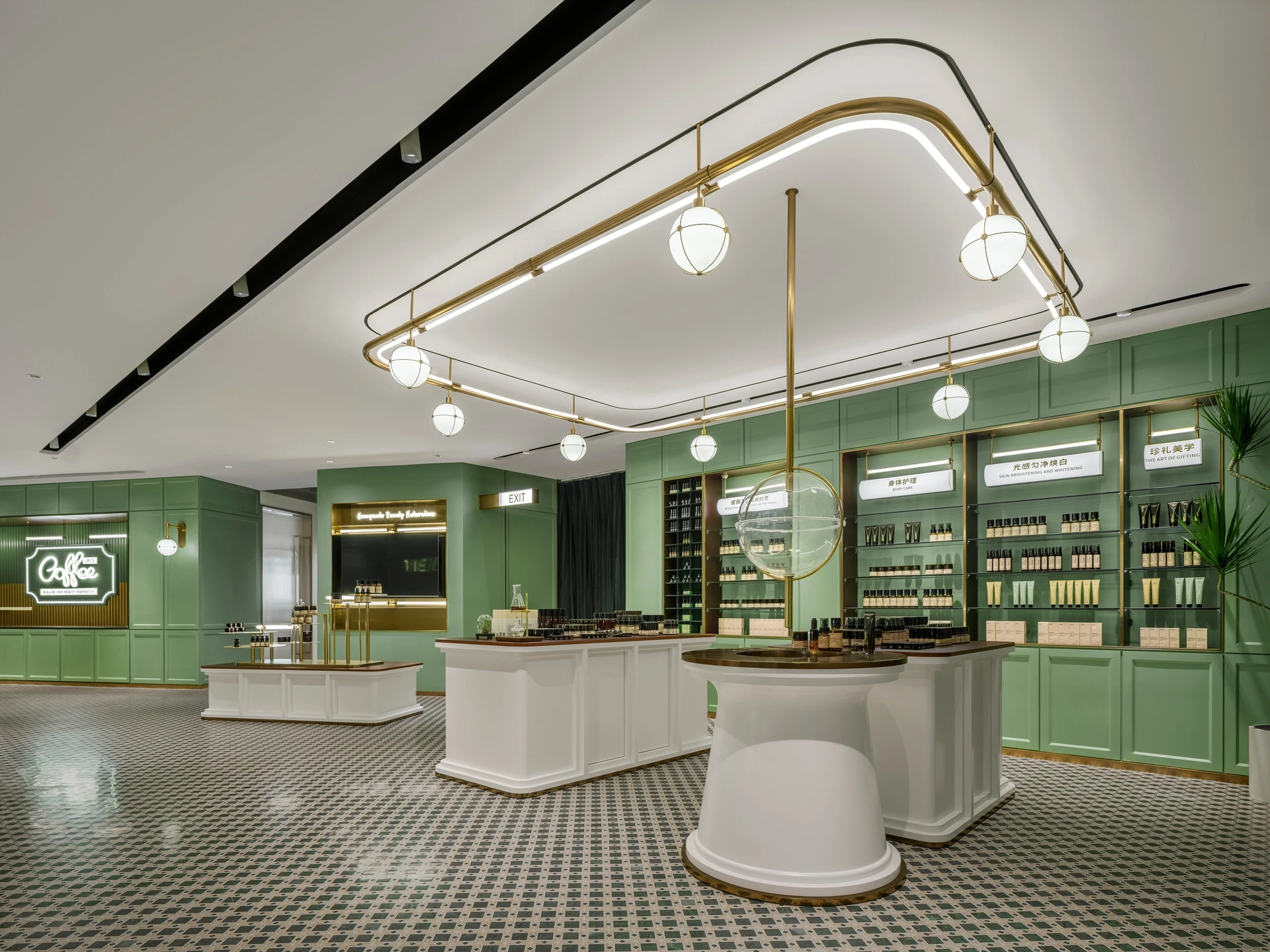
On the other side of the space, a circular stand made of green transparent glass tubes forms the show stage for products.
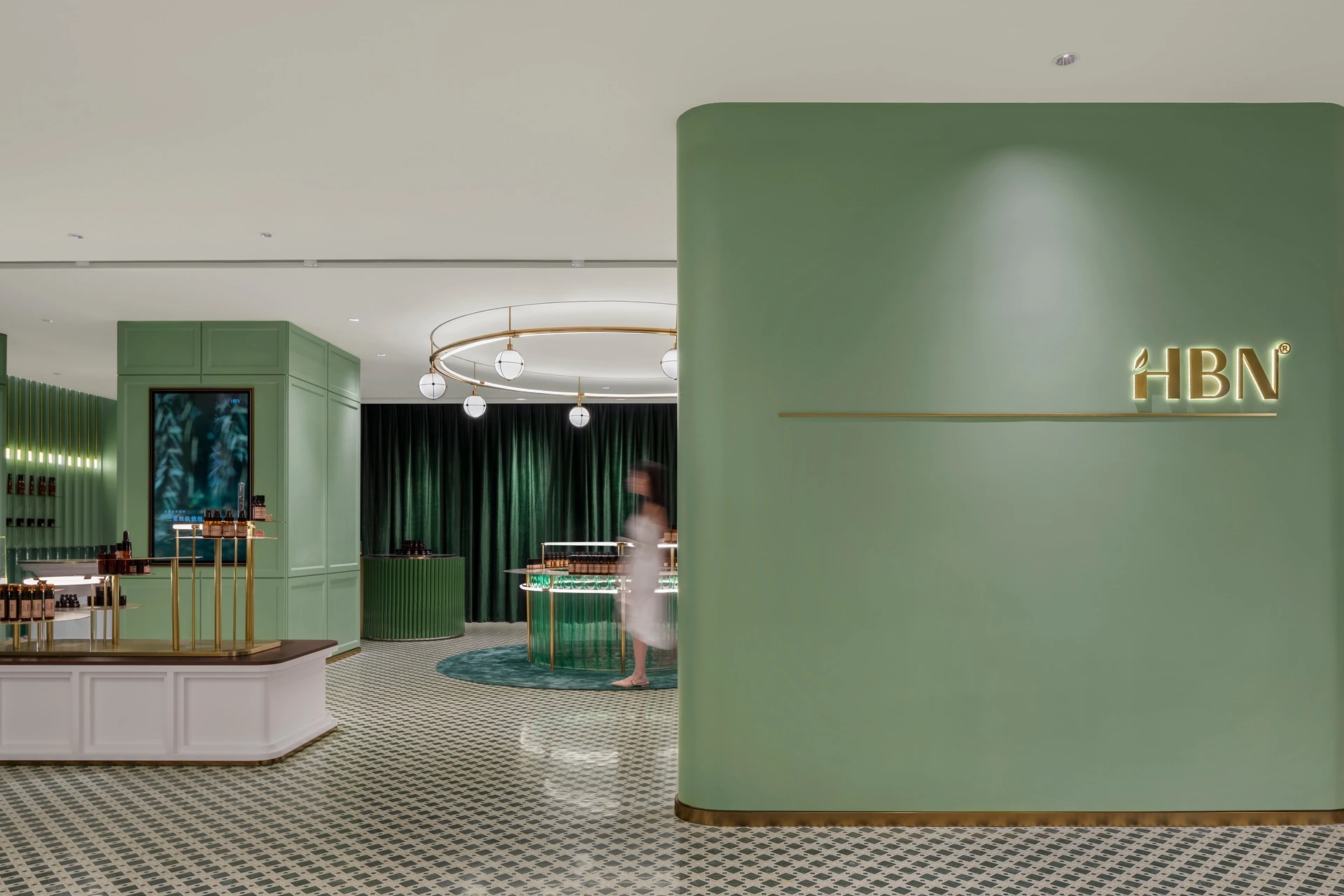
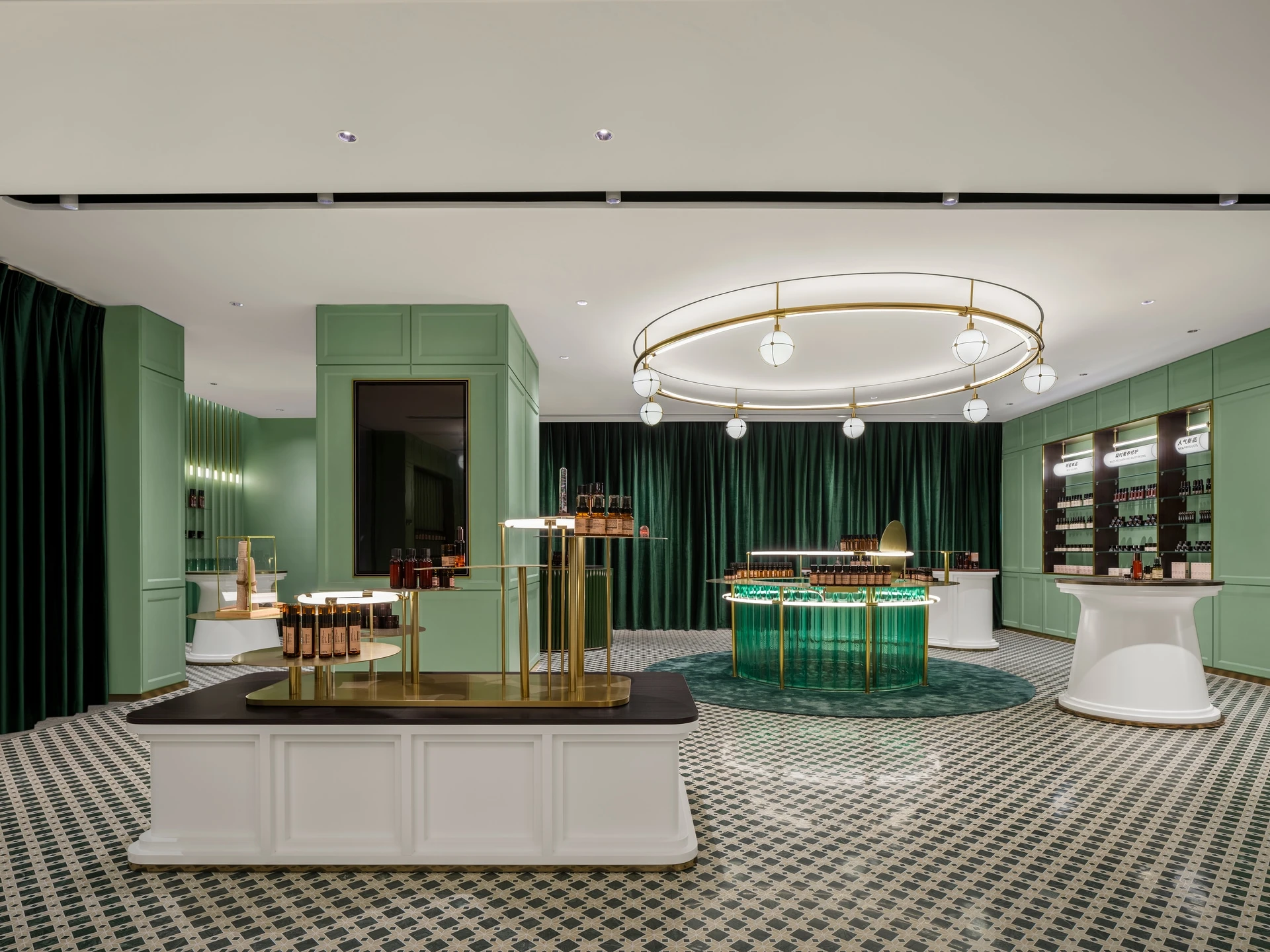
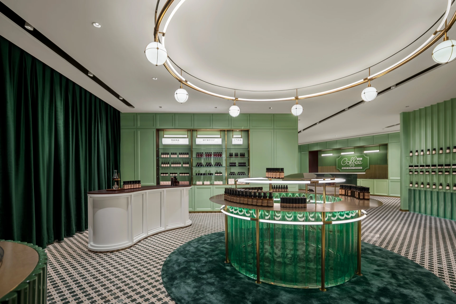
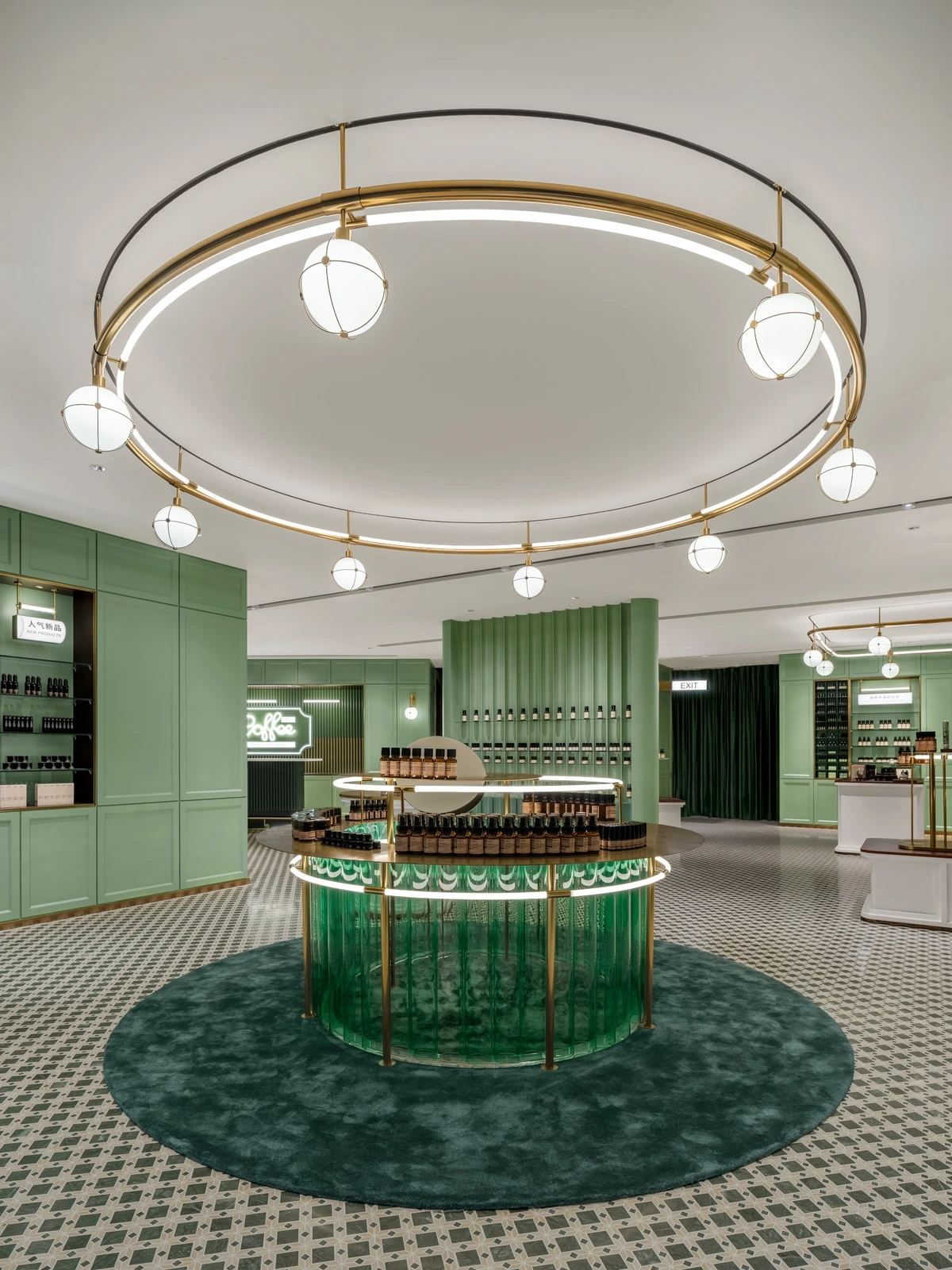
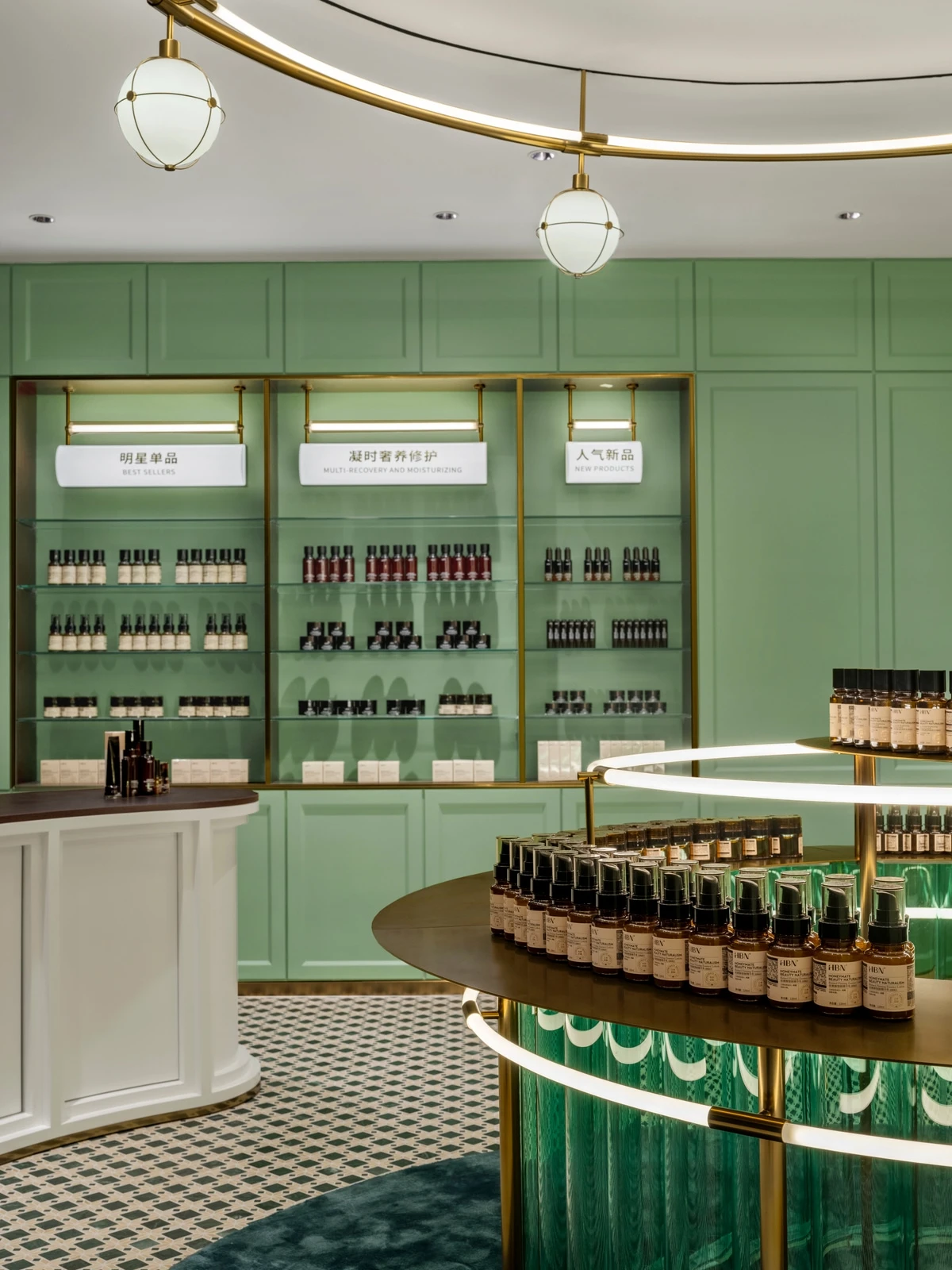
The cylinder glass tubes mimic the test tubes in the lab, responding to the amber bottled products on the shelves.
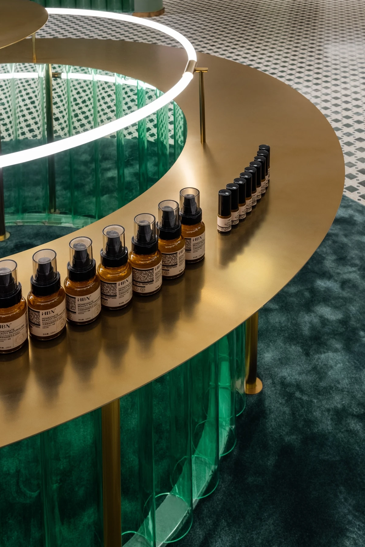
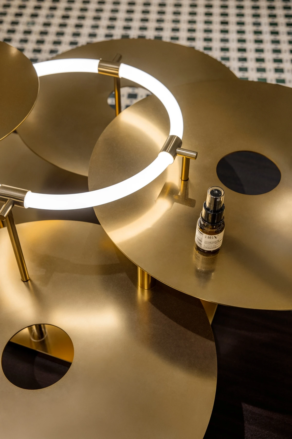
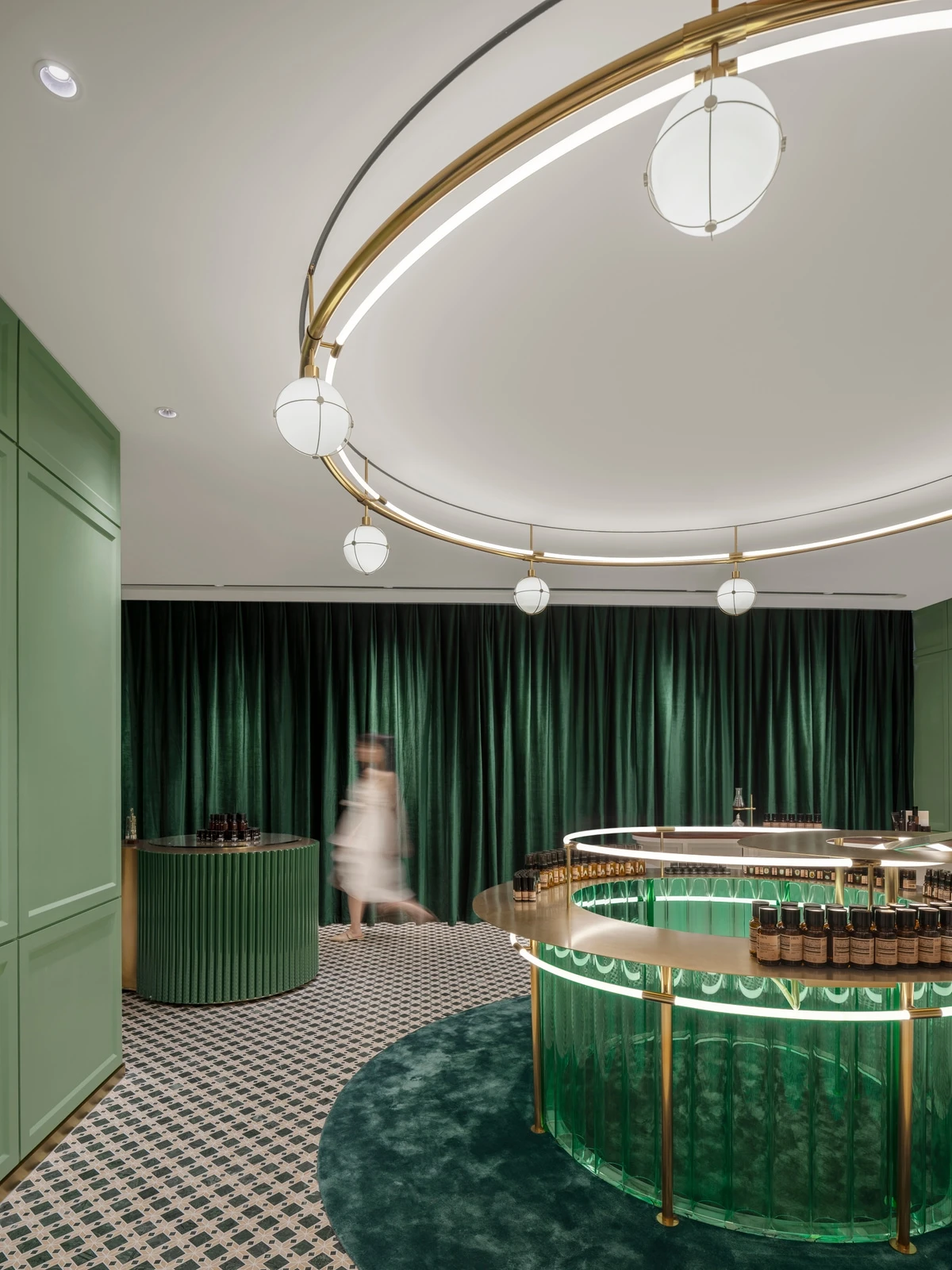
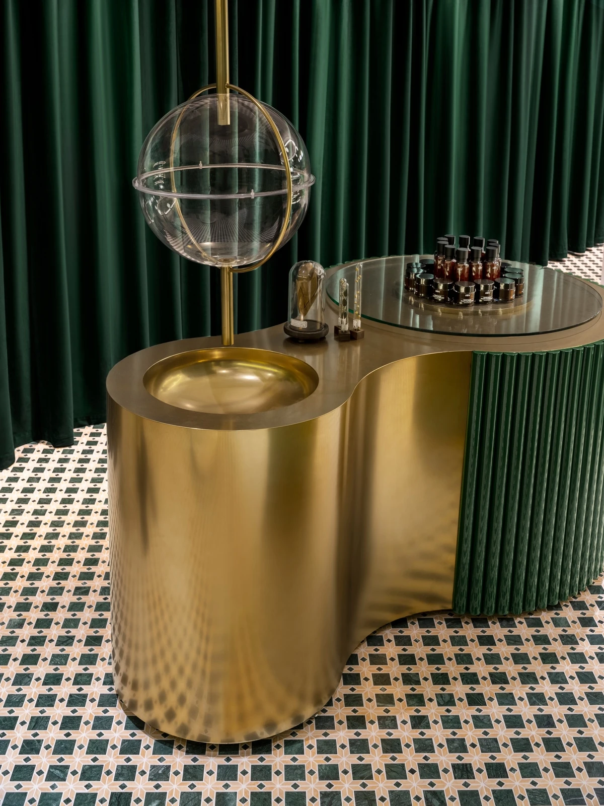
MOC also sets up an area for users to try out products. A turntable is easy for accessing the products and an auto-sensing spherical water dispenser is well matched with the pendant light. It is expected to speak to users when they are trying the components and texture of products.
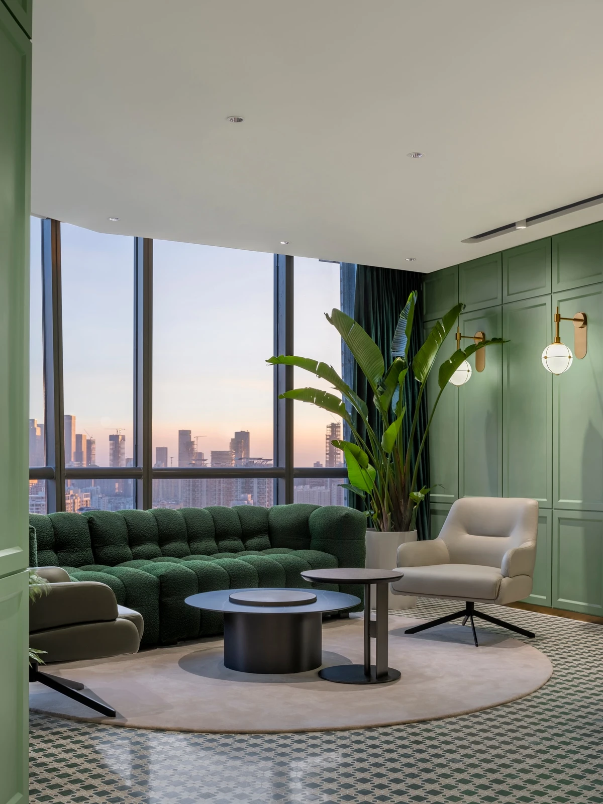
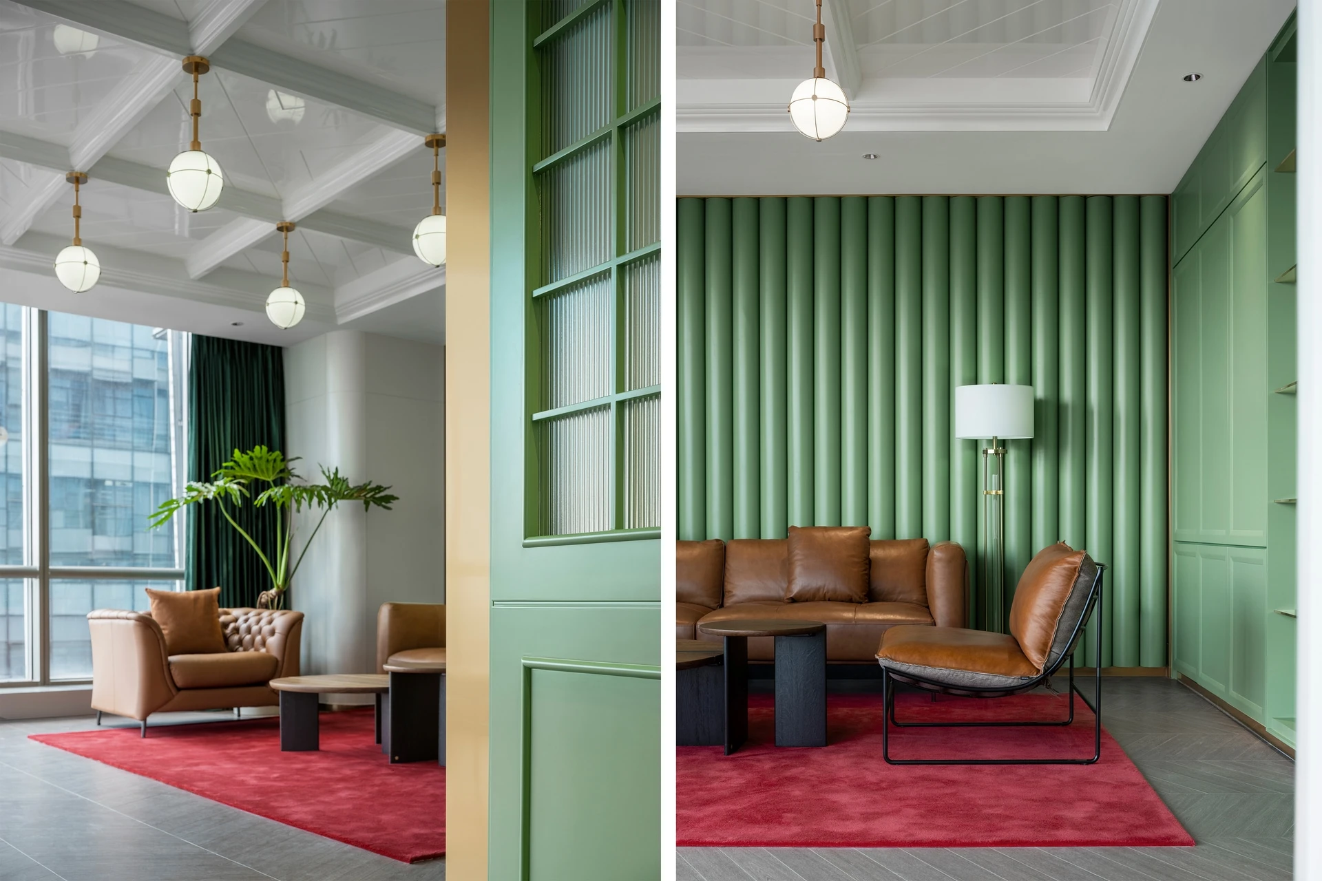
The lounge area is planned by the window, providing the function for relaxation and communication.
03. An Efficient Office
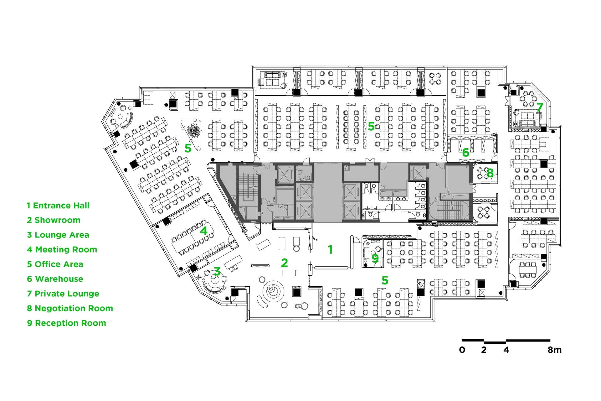
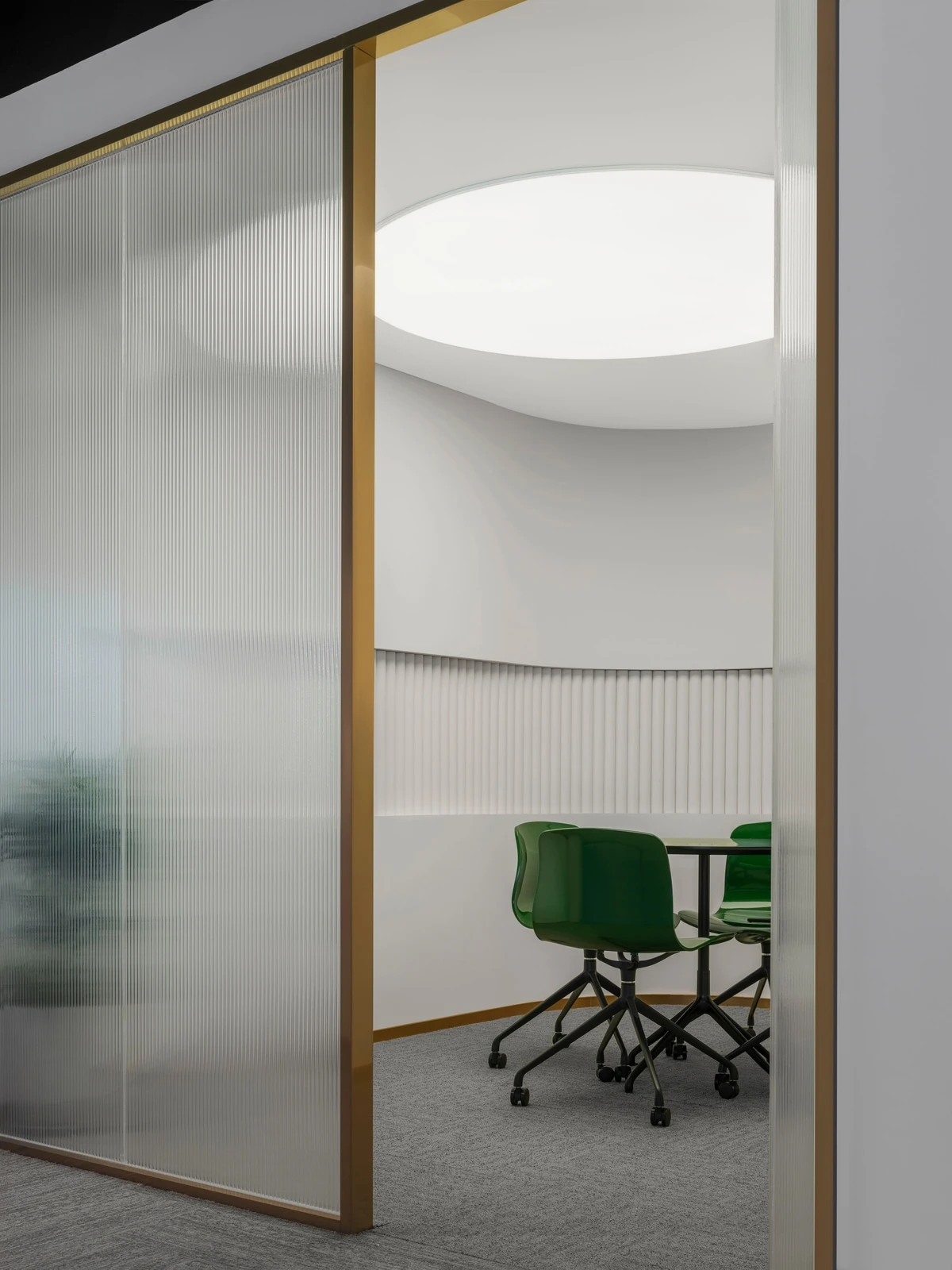
When combining the function of display and office in the scenario, MOC pays more attention to the traffic flow in the showroom and office area. Different moving paths are designed to meet the needs of different people.
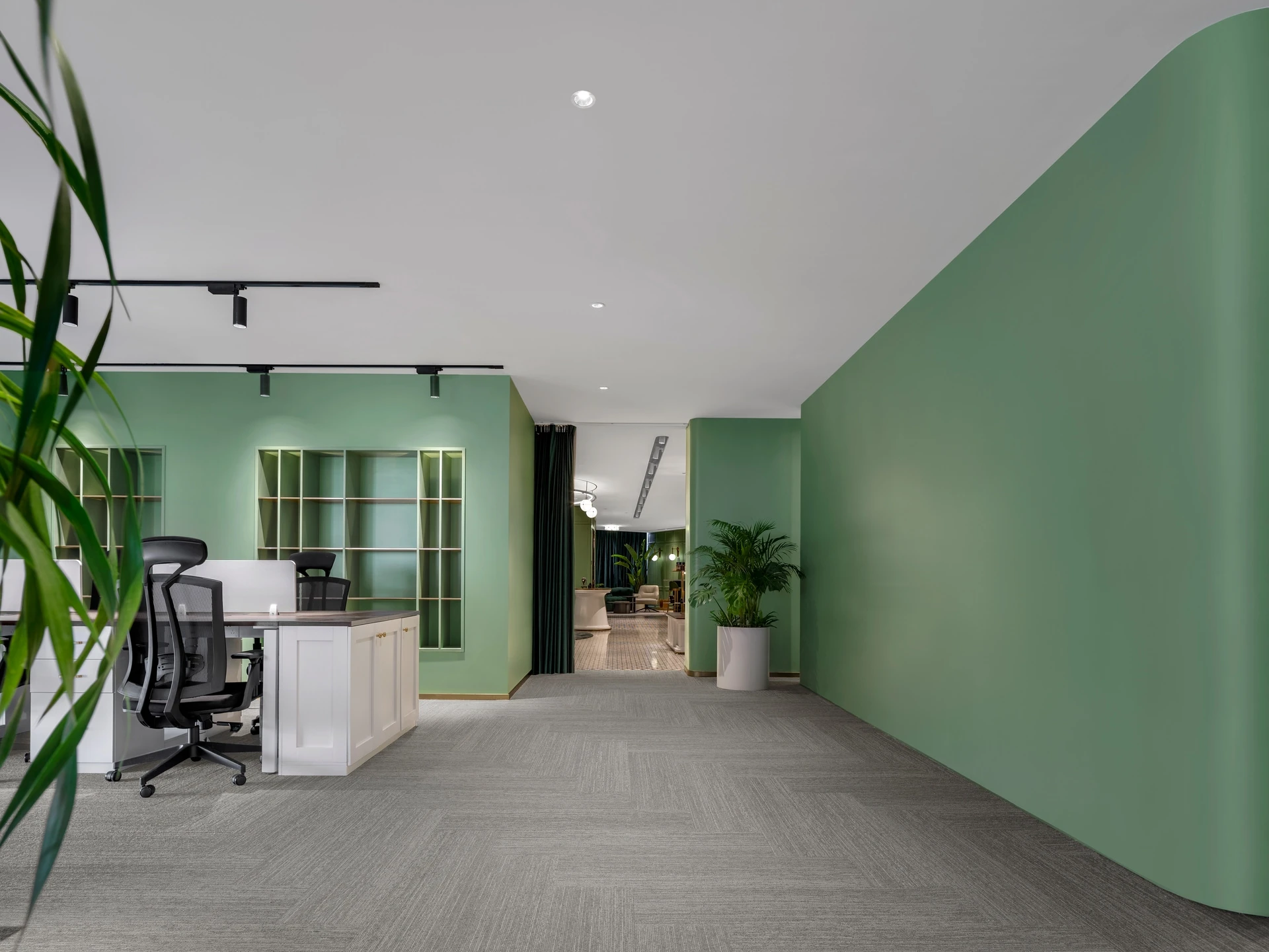
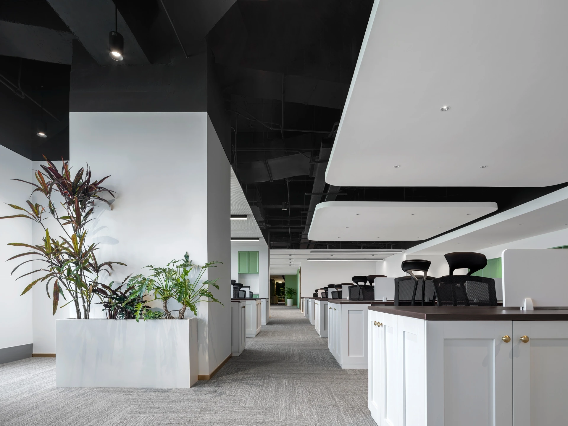
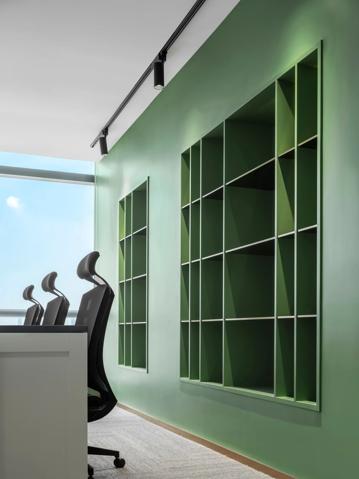
In the office area, the color palette is varied in a uniform tone. Brighter colors make it a good working environment for staff who works for a long time.
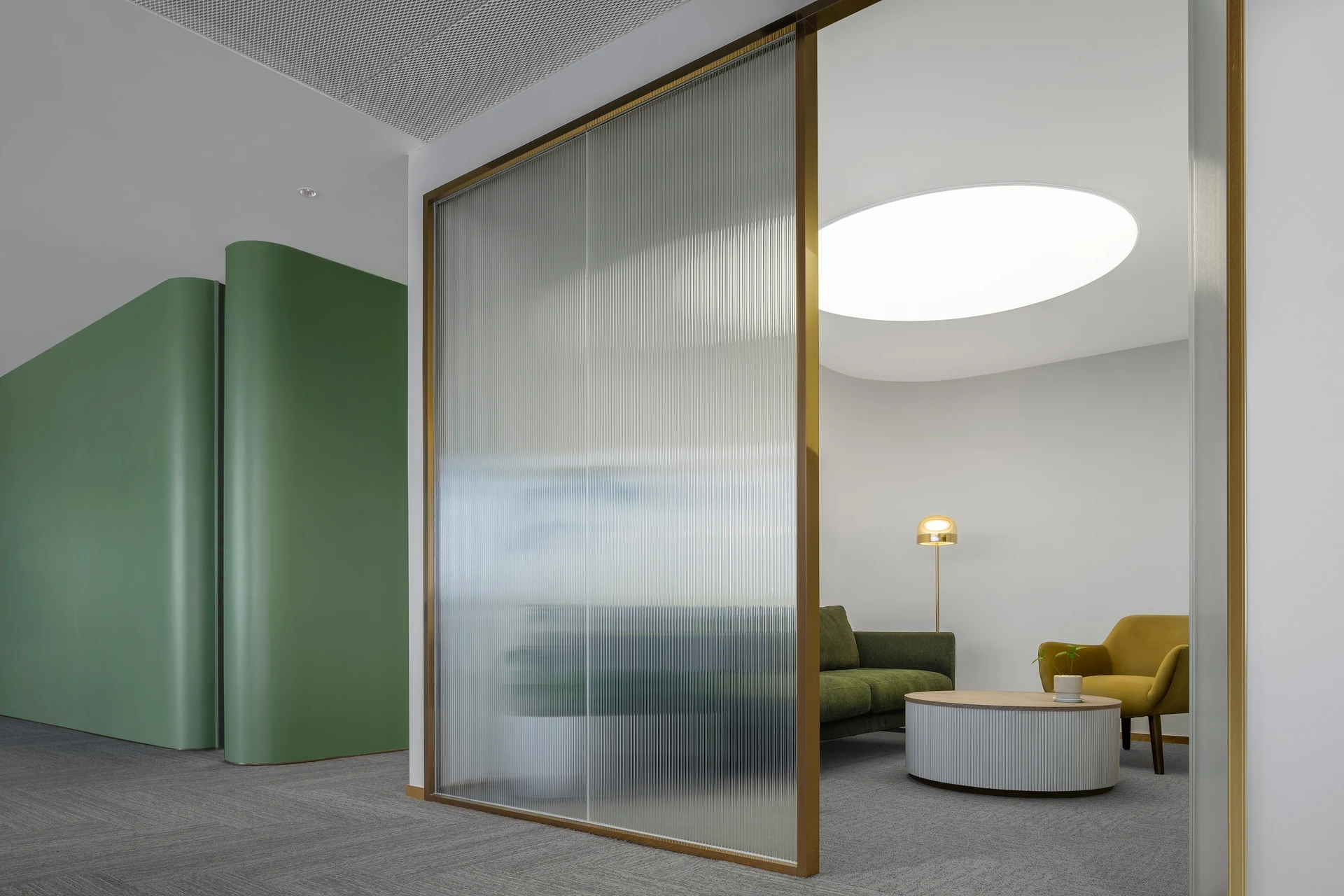
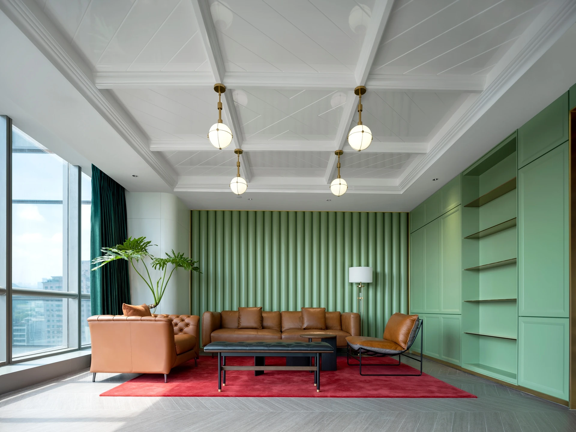
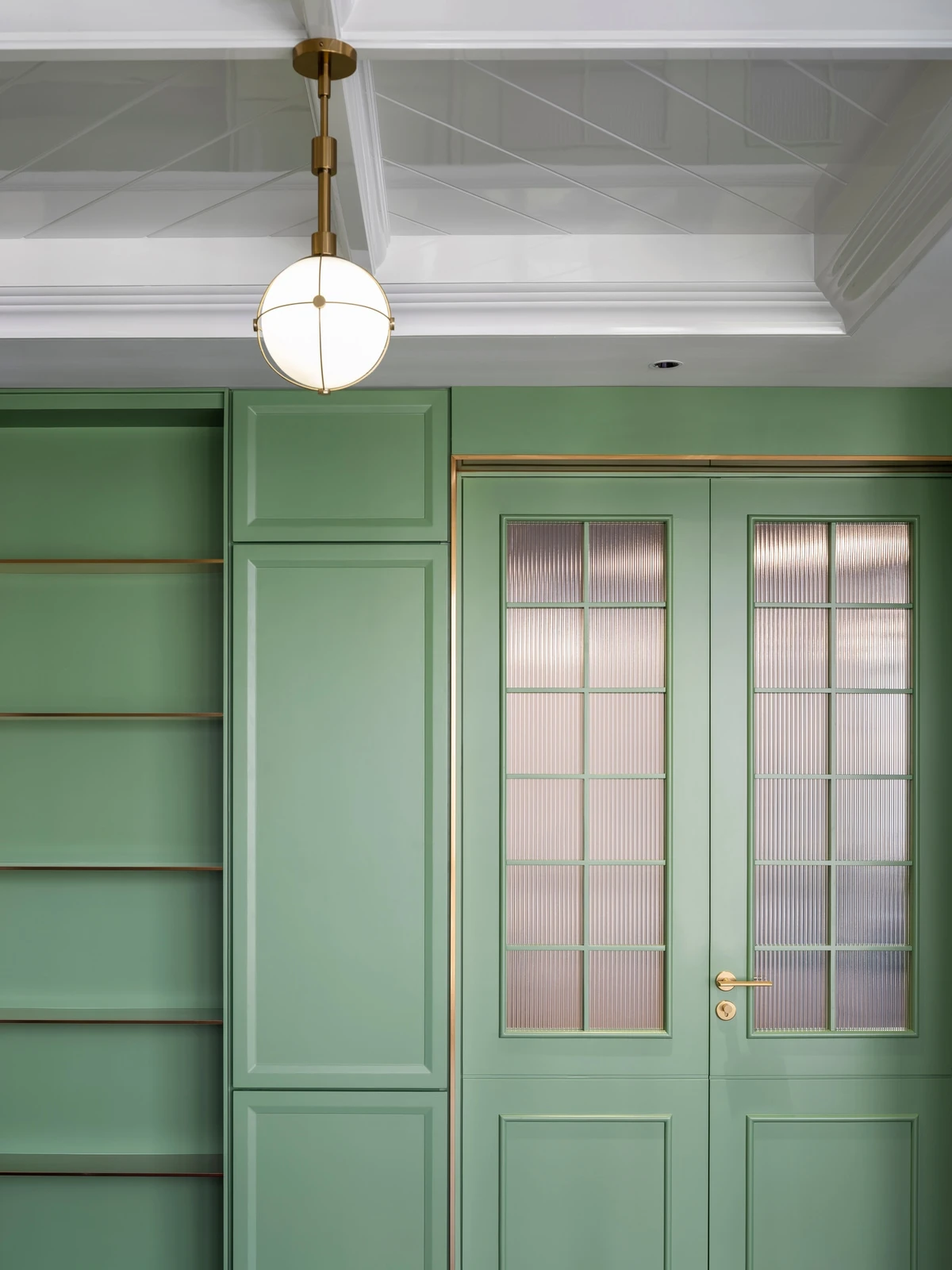
The private lounge also adopts the retro style.
本文内容由 MOC DESIGN 提供或来源于其官方媒体渠道,由 WeHow 整理编辑。图片、视频及相关设计作品的版权归原作者/设计方所有。未经 WeHow 及版权方书面许可,禁止以 WeHow 编辑版本进行任何形式的转载或商业使用。