“The architectural approach is to pull back the main building and at the same time integrate it with the ‘Mirror in the Sky’ sculpture. The designers have integrated the architecture and interior design to create an immersive brand experience from a distance to up close, from the brand impressions on the first floor to the life scenarios, experiences and product showcases on the second floor.”

The first Whirlpool House in Shunde OCT Harbor PLUS was recently unveiled to the public. Unlike traditional flagship stores that solely focus on selling products, Whirlpool House prioritizes interactive displays and experiences that allow consumers to gain a more direct understanding of the brand and products. As a century-old brand, Whirlpool has undergone a transformation in the hearts and minds of consumers, boasting a new look and feel.

The retreat of building
The project site is located in the striking iconic “Mirror in the Sky” architectural sculpture, with the building seamlessly integrated into the installation.

As a brand founded on cutting-edge technology with over a century of experience in the home appliance industry, Whirlpool aims to make a powerful first impression to its visitors through its showroom’s high-tech design and state-of-the-art features. The mirror effect and cut shape of “Mirror in the Sky” naturally incorporate technological elements.
Keeping this objective in mind, the designers have opted for a unique approach by recessing the building facade and seamlessly integrating it with the sculpture. This clever integration serves to connect the exterior and interior of the building as one cohesive unit, effectively extending the visual theme of “Mirror in the Sky” into the interior space. The triangular prism extends upwards from the first floor to the second floor and reaches the ceiling, forming a harmonious connection with the “Mirror in the Sky” through a glass curtain.


From the main entrance, one can observe the intriguing interplay between mirrored interior and outdoor sculpture, thereby establishing a captivating relationship between the inside and outside.

The look of the first-floor space is a reflection of the prismatic installation.

An experiential journey in progress
Whirlpool House is a comprehensive commercial space that aims to cater to various needs, such as brand culture display, experience showroom, and event forum. The designers have taken a thoughtful approach and assigned different functions to different floors to offer visitors a seamless journey of progressive experience. This means that visitors can immerse themselves in the brand’s culture, engage in experiential activities, and explore the products on offer as they move through the different floors of the space.


The first floor features a prismatic installation that sets the tone for a sleek and tech-savvy ambiance.

Multimedia interactive exhibits educate and engage visitors on the brand’s history and core technologies.


On the other side of the showroom, the tech display area showcases the brand’s laundry products. Through clever deconstruction and the use of interactive wall games, visitors are able to easily grasp even the most technical details, turning what could be a mundane experience into an engaging and informative one.


The coffee area, located on the side of the walkway, seamlessly blends indoor and outdoor spaces with its openable curtain wall.

The furniture shape complements the space when it is viewed from the inside.

The light-flowing observation elevator to the second floor is designed to resemble a prism that extends from the floor to the ceiling, connecting the inside to the outside. This unique design element not only lets in natural light, but also creates a dialogue between the two spaces.


The clean and powerful architectural language of the space is a reflection of the brand’s philosophy of simplicity in product design. This is further exemplified through the integration of a scenario-based product experience area, which offers a flexible, open and dynamic social space that encourages visitors to explore the possibilities of interaction between the space, people and daily life.

The prism effectively separates different styles of product experience scenarios, while wood elements add warmth to the cool metal surroundings.


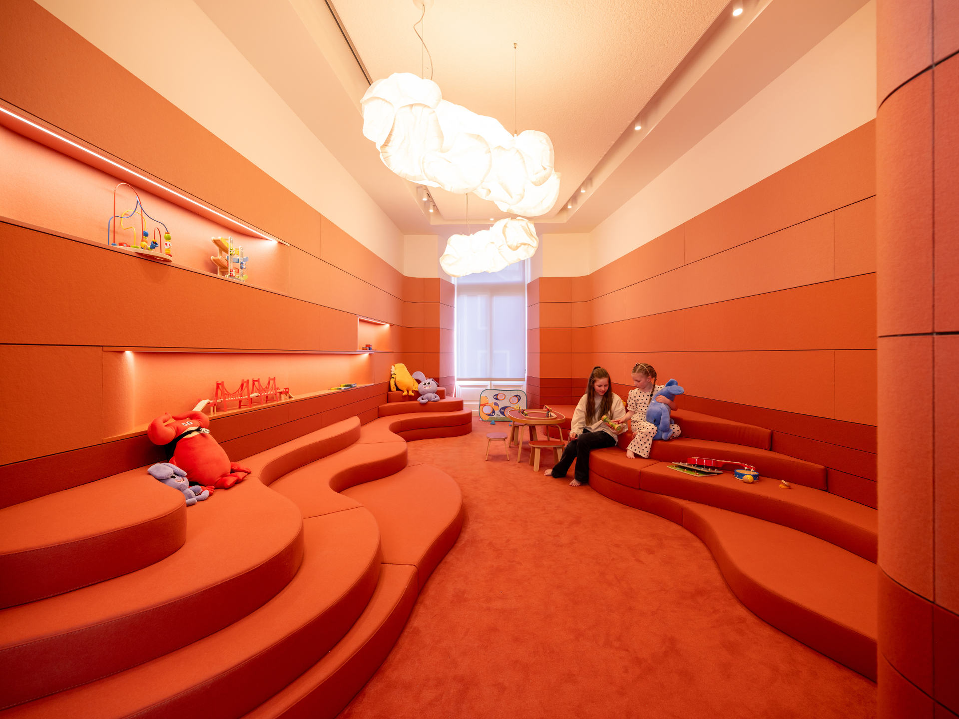
To balance the overall tone and color of the space, the designers have also incorporated a bright yellow children’s area, creating a playful contrast to the otherwise neutral palette.


The mezzanine level continues the warm wood hues, providing a relaxed and inviting atmosphere that allows the products to take center stage.

The content of this article was provided by MOC DESIGN or sourced from their official media channels, and has been curated and edited by WeHow. All copyrights to images, videos, and related design works remain with their respective creators or design firms. Reproduction, republication, or commercial use of the WeHow-edited version in any form is prohibited without prior written permission from both WeHow and the respective copyright holders.